
The Task:
Design a booklet using grid layouts, text, and imagery that covers the work of a chosen graphic designer. Include an inspiration piece that emulates both the subject and my own design style.
The Subject:
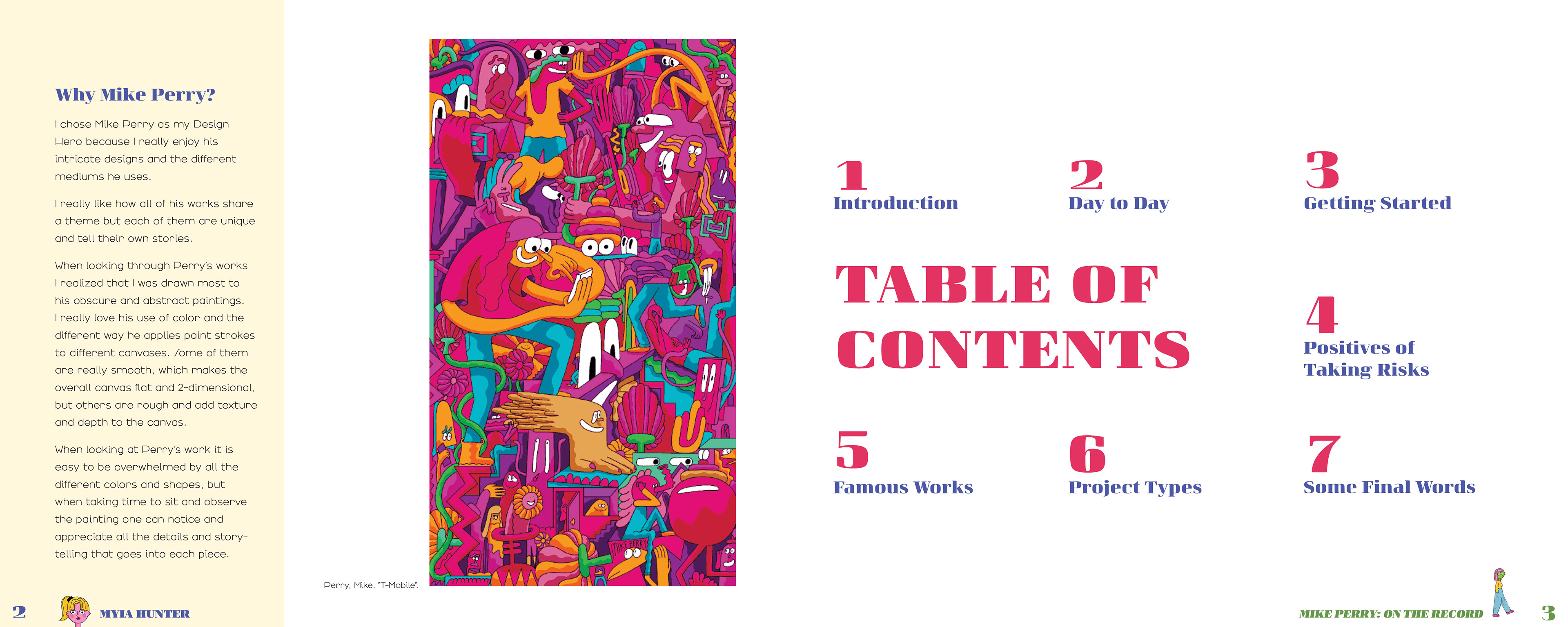
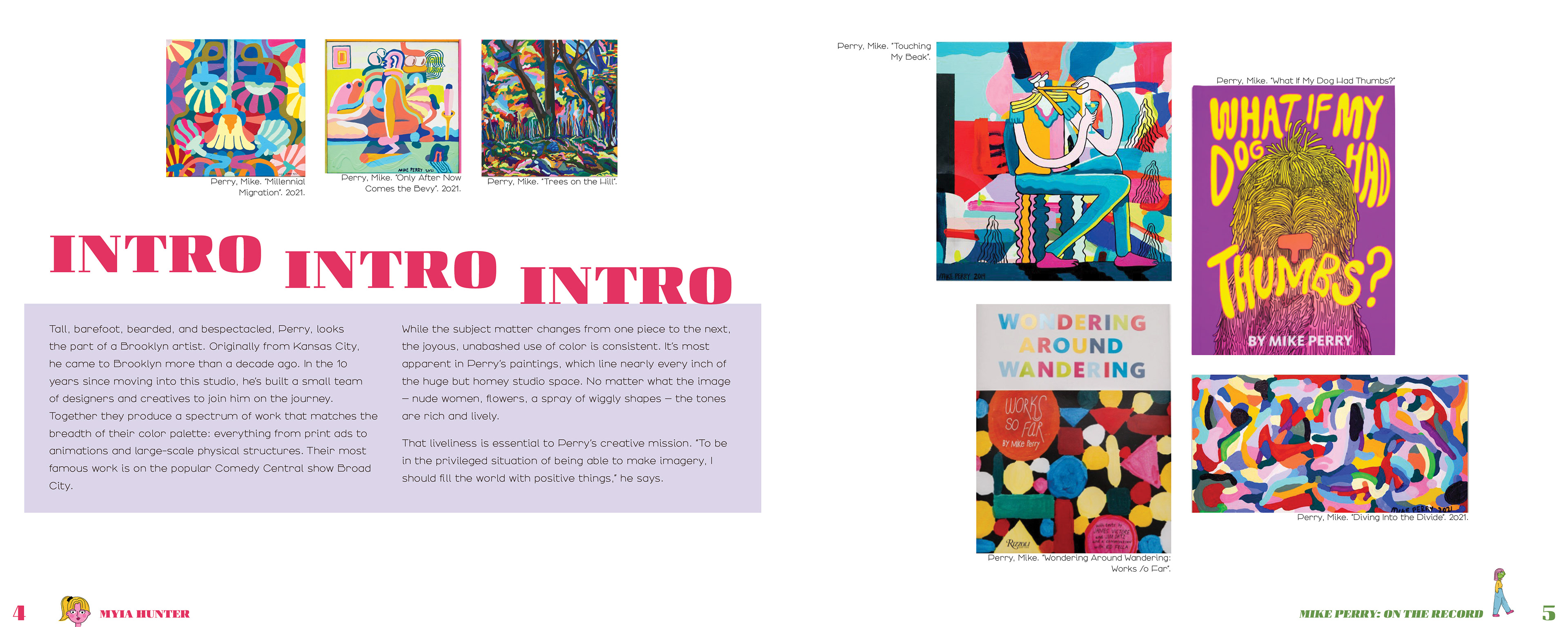
Mike Perry, a graphic designer who utilizes several art mediums and has a very bright and abstract style.
The Approach:
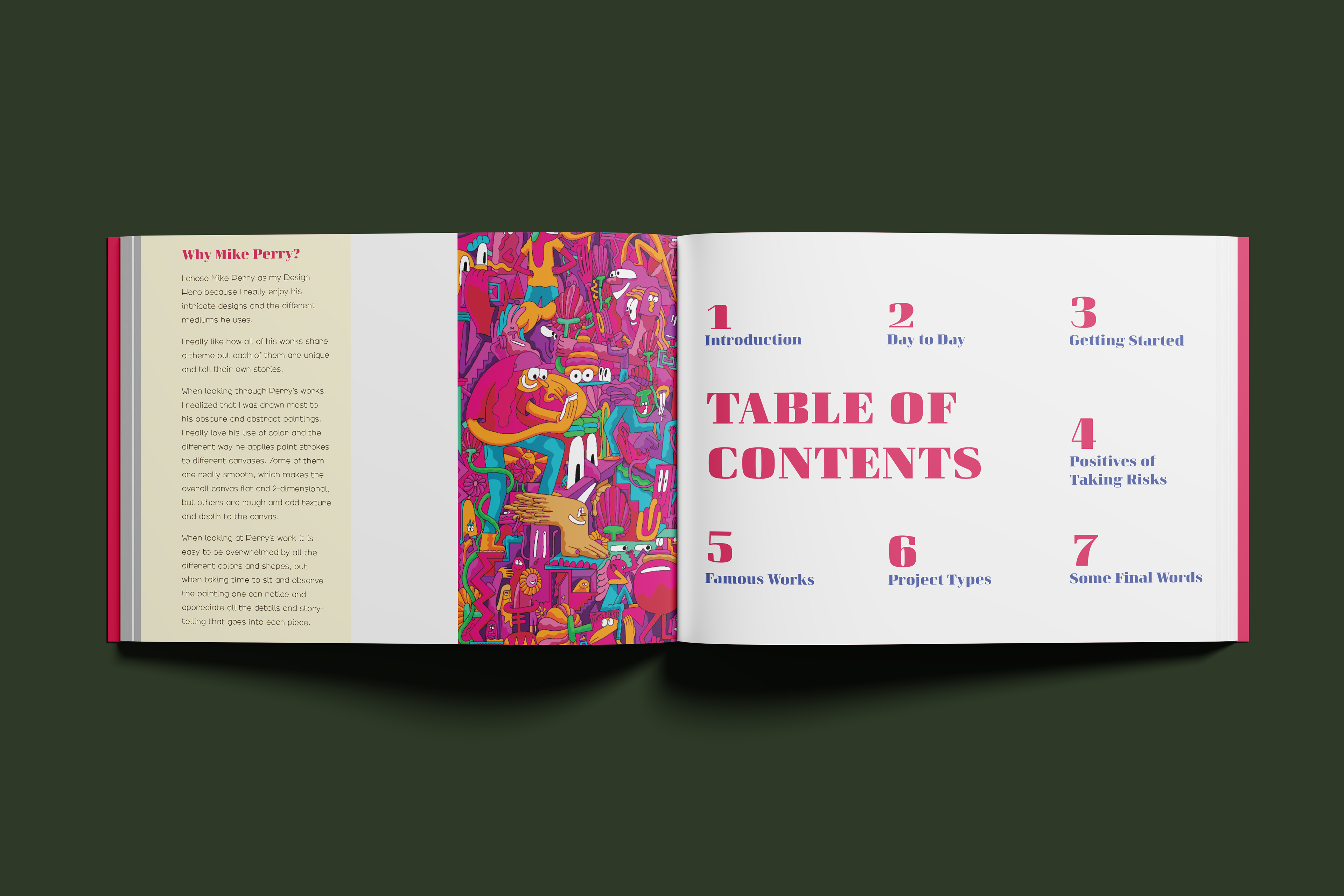
I wanted to create a booklet that was similar to Perry's art style: bright and amusing. To achieve this, I chose to use interesting typography and very bright colors. Since it's a book, I chose to not include irregular shapes (even though it would complement Perry's works) because it would take away from the words and artwork.
Typography:
Arbotek Light
Curve
Variex Ot
Chorine
Colors Used:
#e03462
#f26a43
#ffdf00
#ffad33
#67964b
#4c58a8
#a78aeb
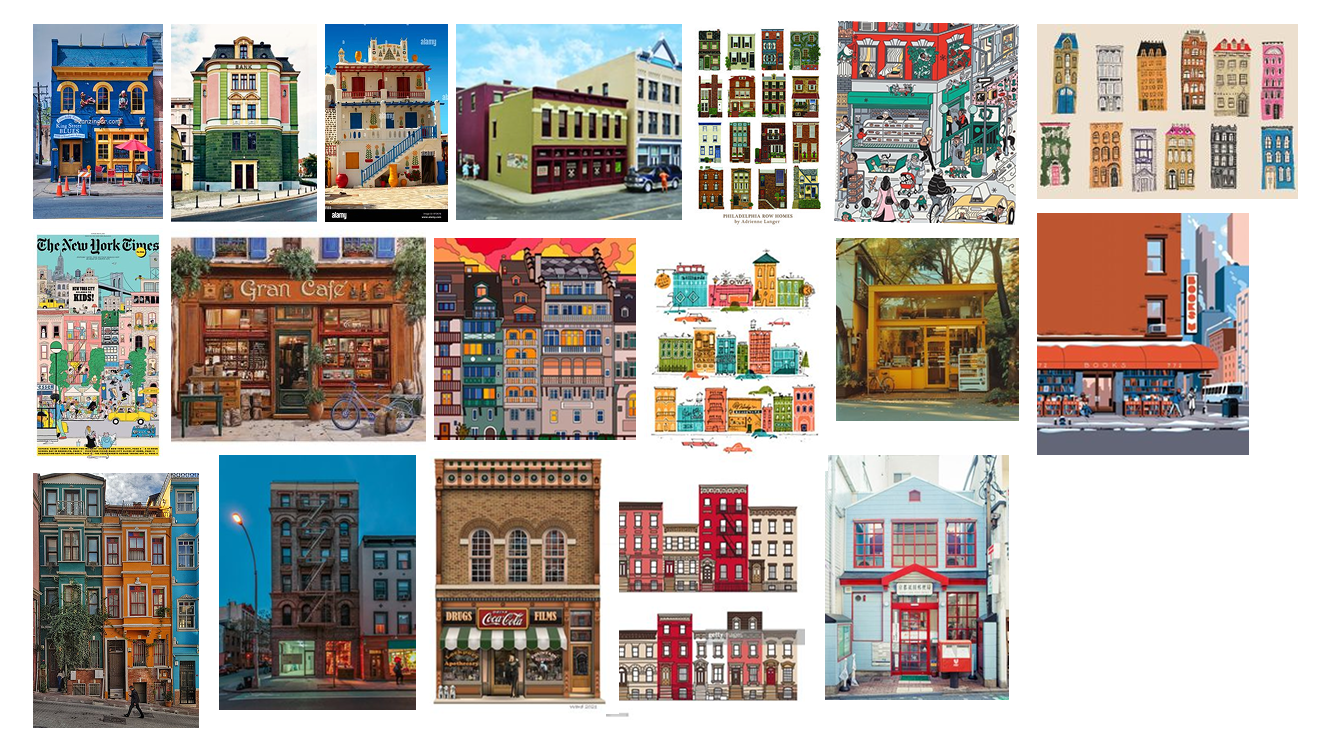
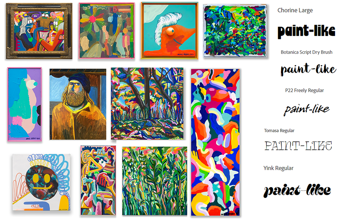
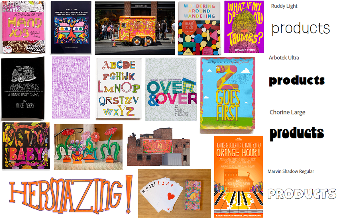
Mood Boards
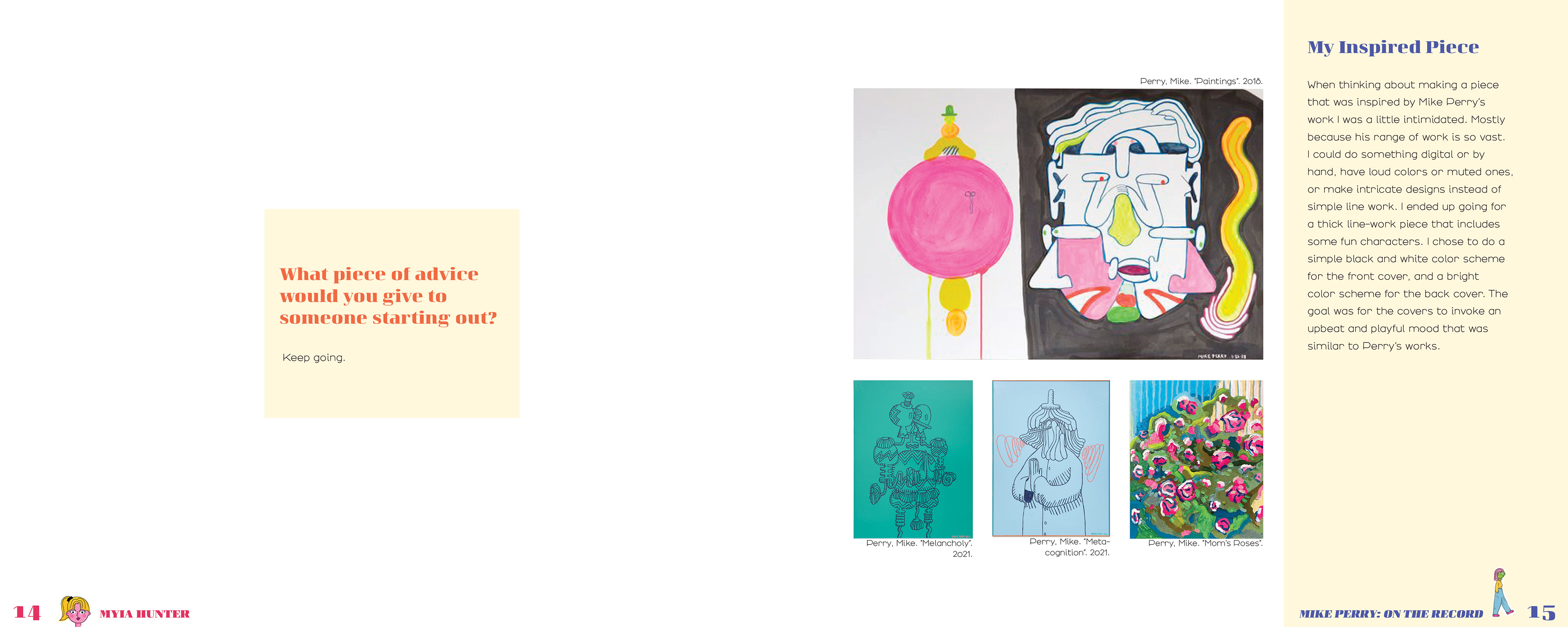
These mood boards helped me establish the design direction for the book. They focused on Mike Perry's different art mediums and styles. Organizing his work like this helped me figure out which of his art mediums matches closely to my own.

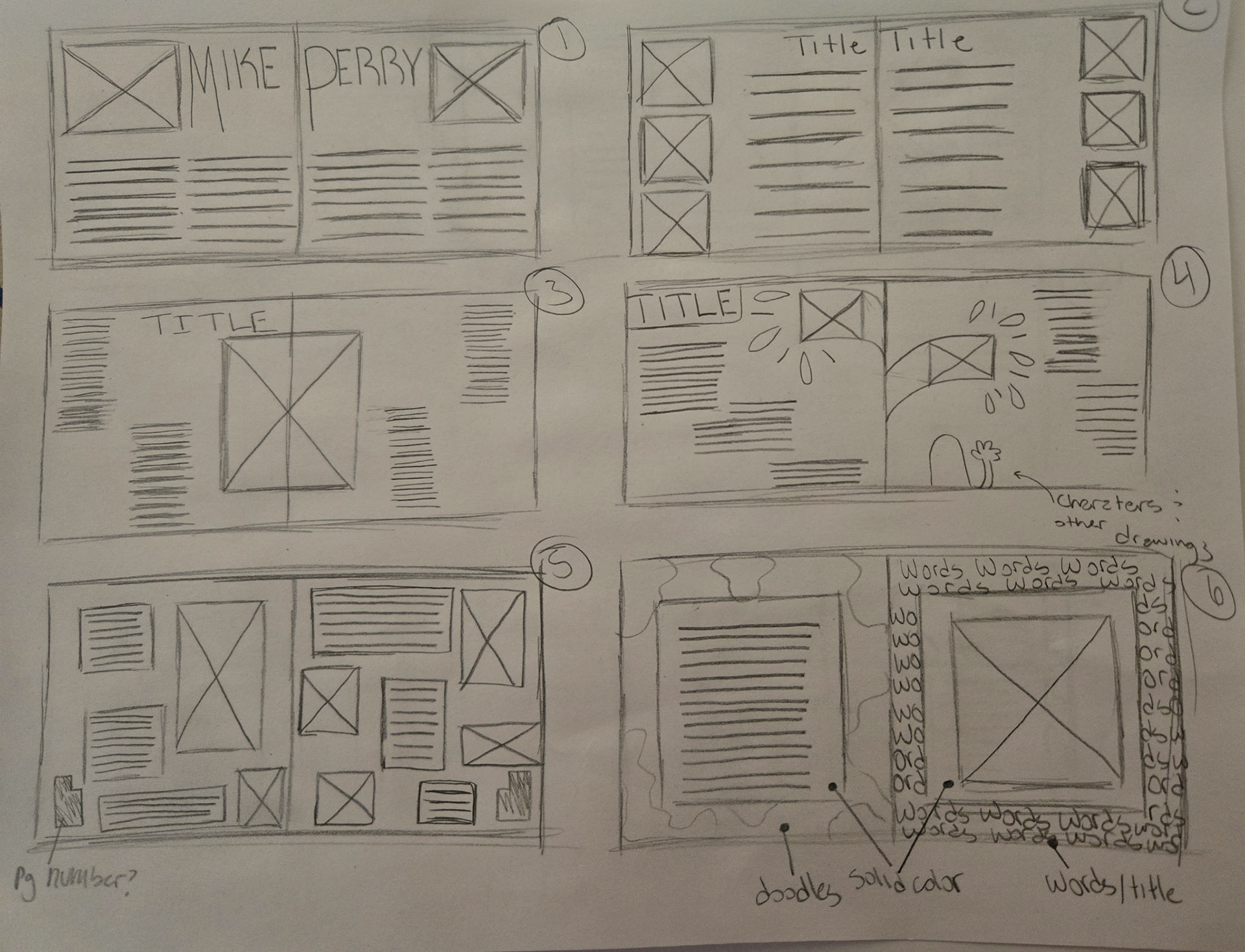
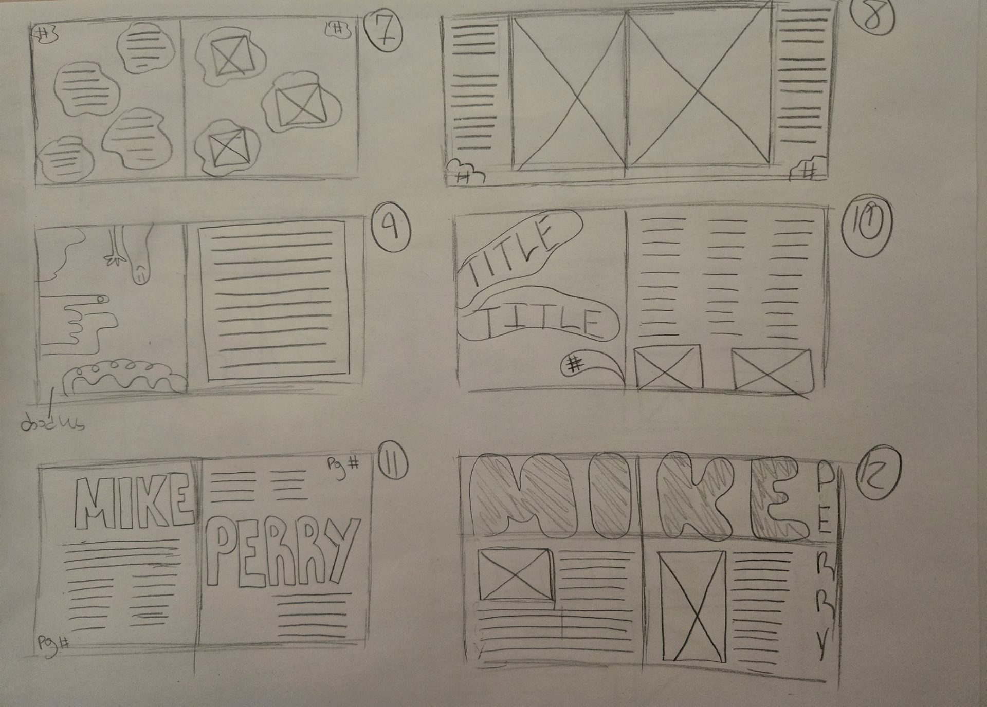
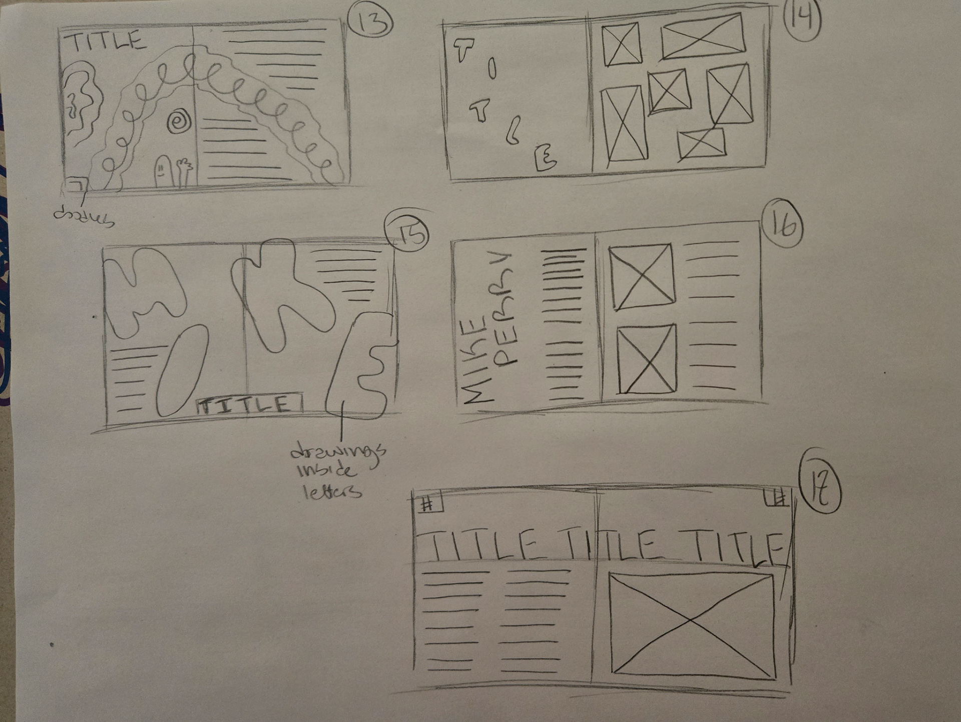
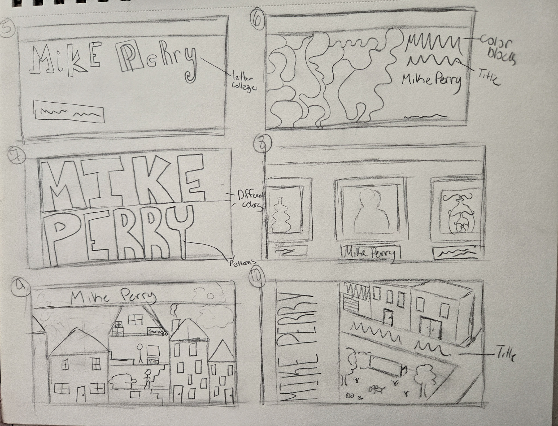
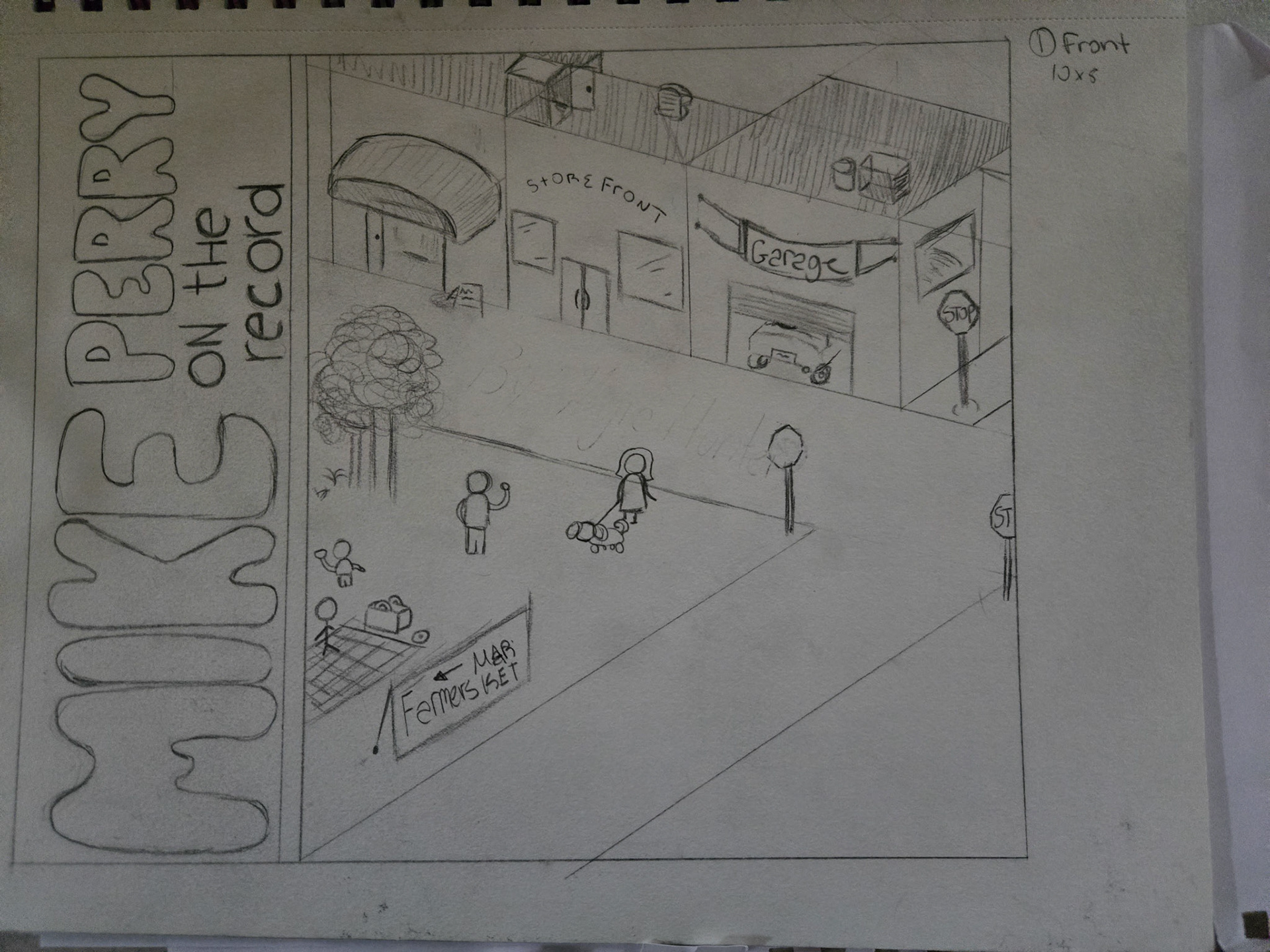
Sketches and Page Layouts
After establishing a design direction, I began creating sketches of both the covers (my inspiration piece) and the layout of the overall book. One of the main things I wanted to do was establish a layout that compliments Perry's work. I did this by ensuring that my book includes fun designs and bright colors.
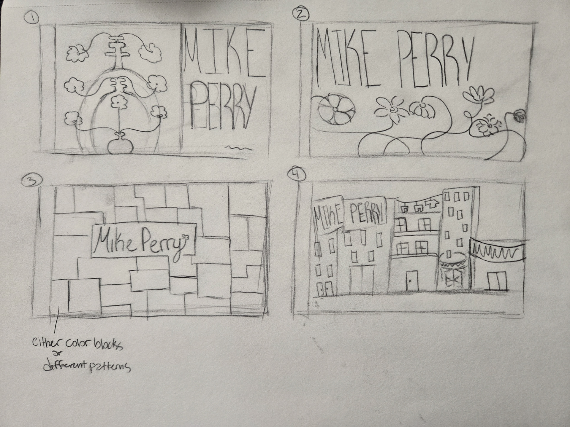
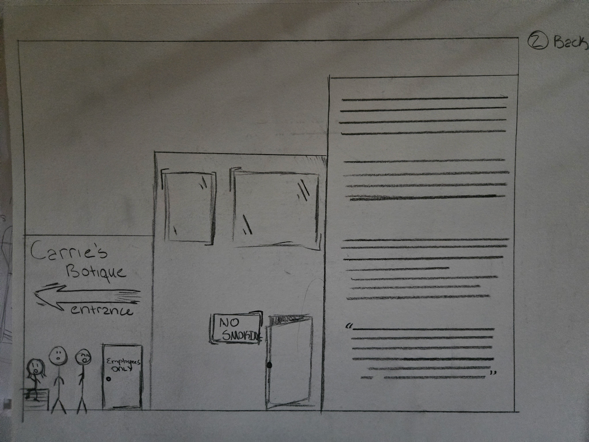
Revised Rough Drafts
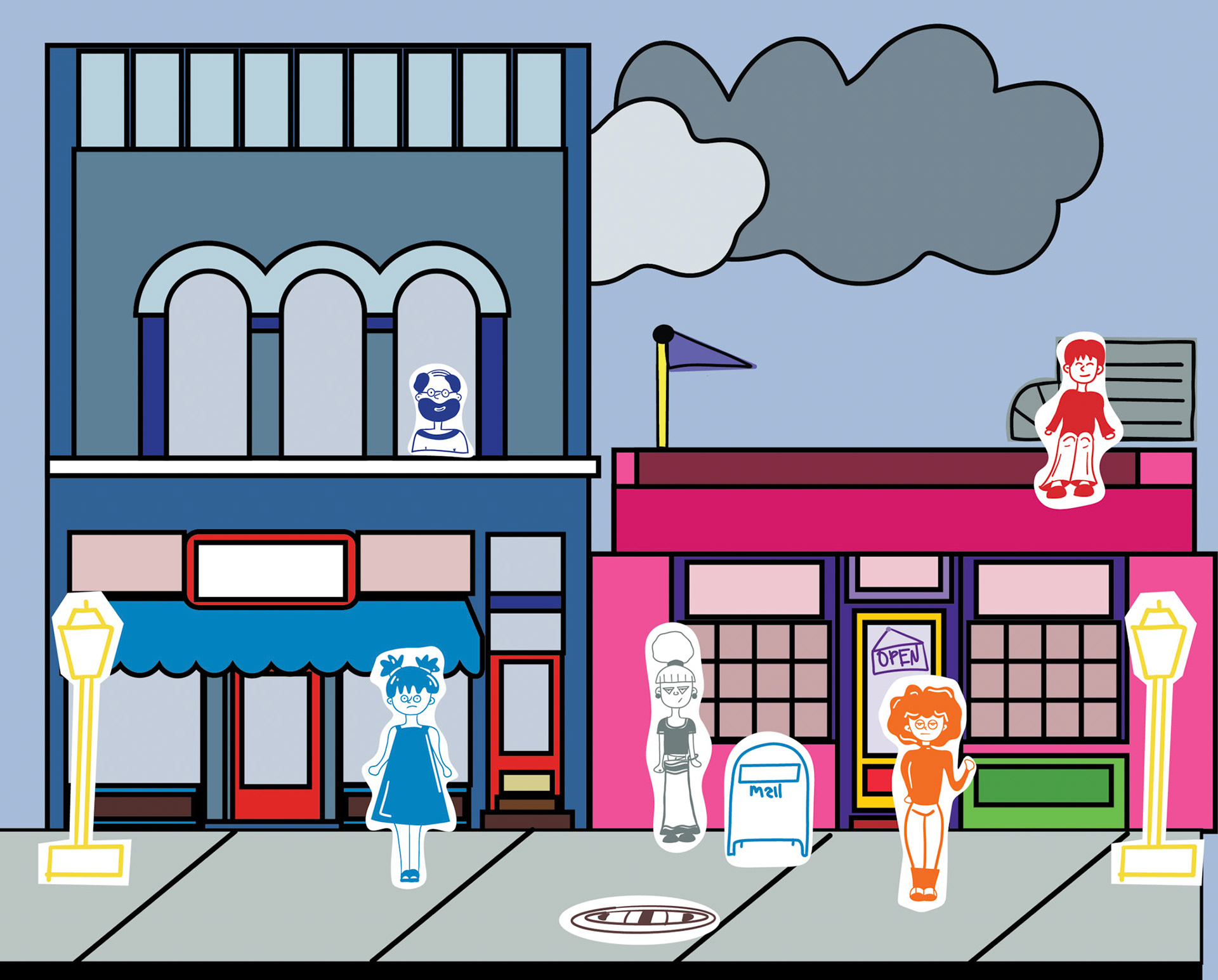
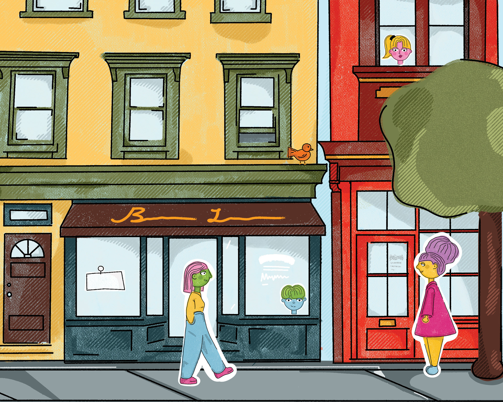
For my revised drafts, I chose to continue with the "street-view" concept seen in my original drafts. This approach provided a good base for adding fun elements and colors.
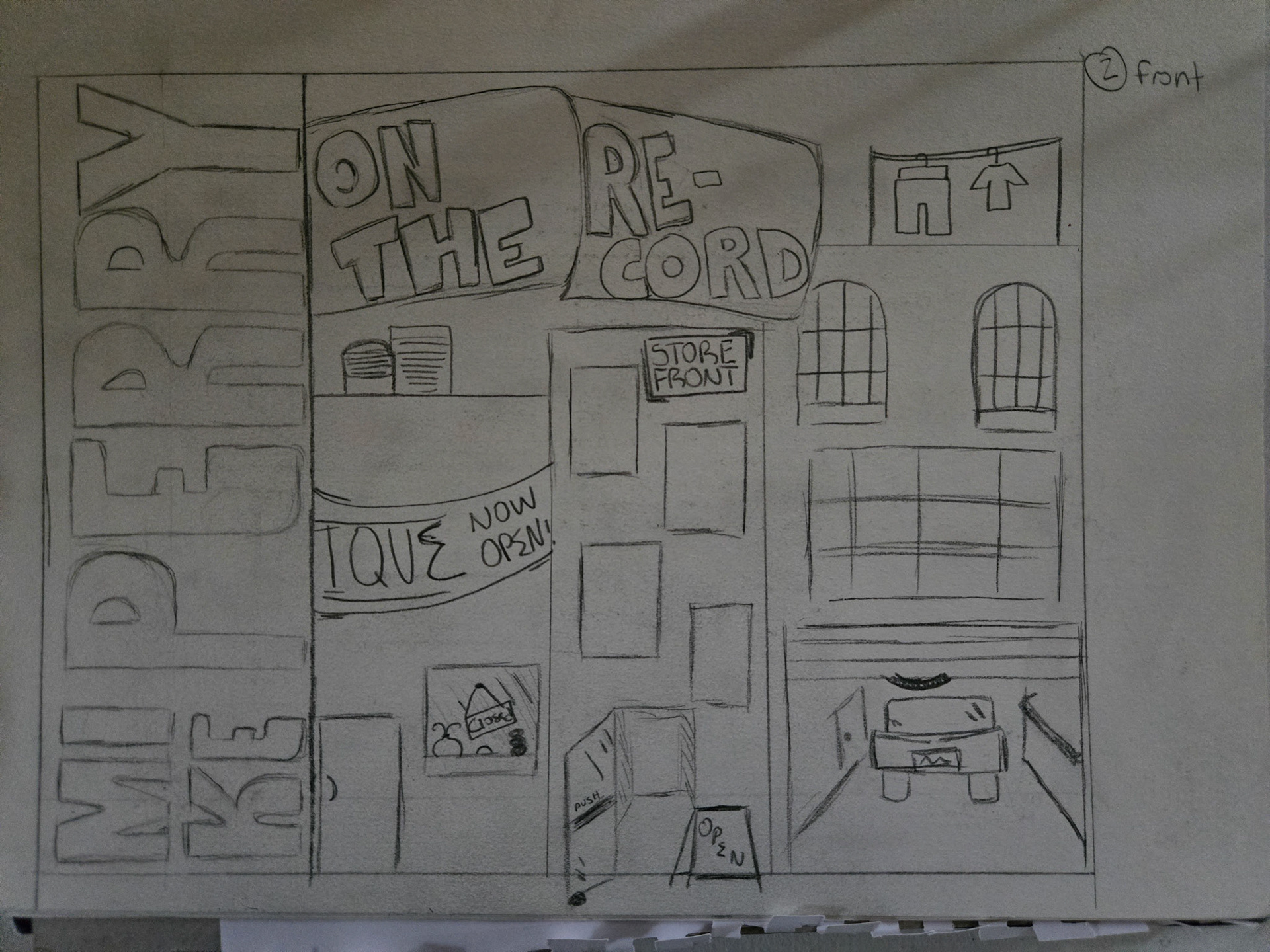
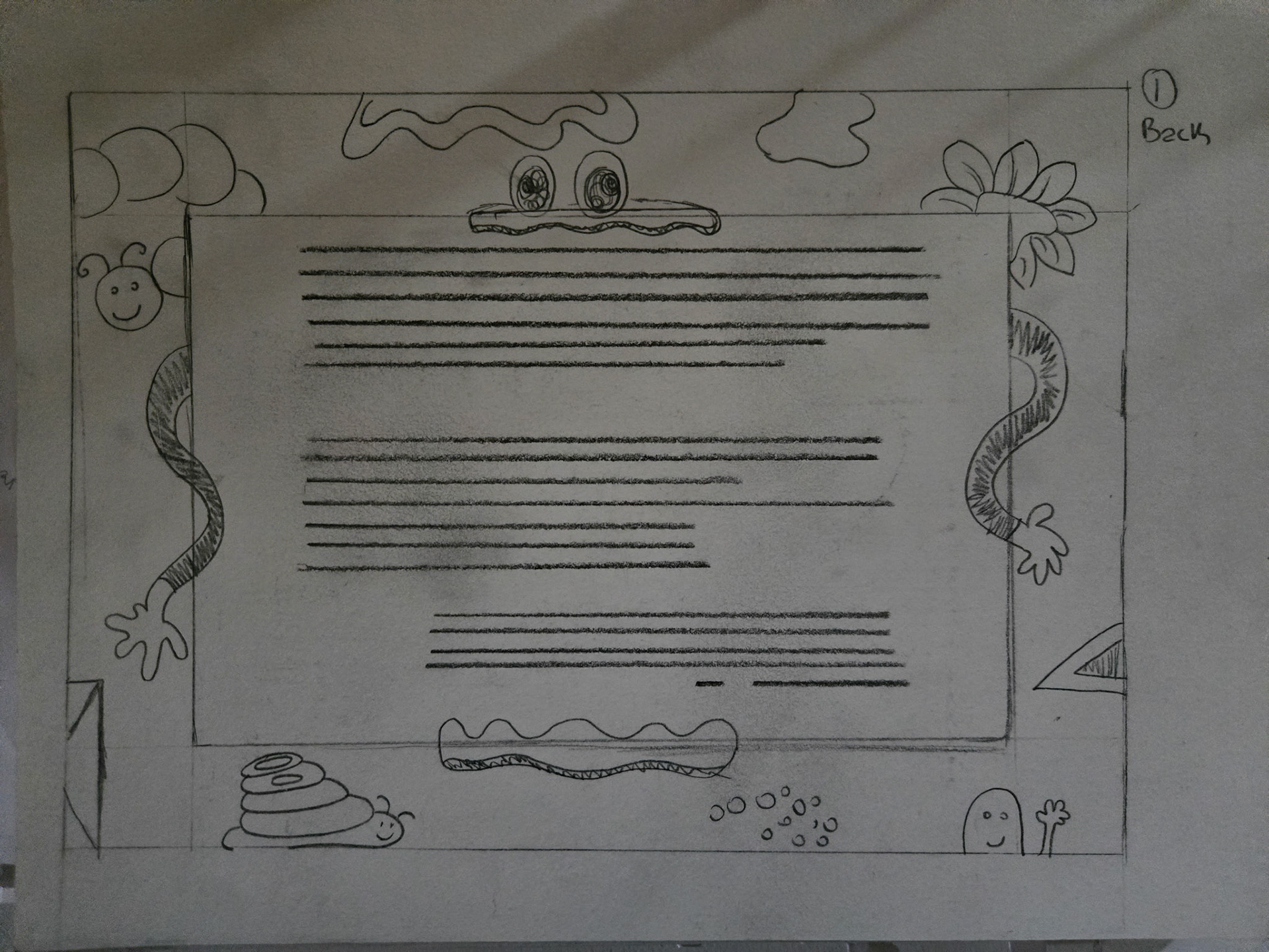
Revised Rough Drafts 2
For the revised front and back color I added fun characters and bright colors, but I wanted to redo the background because it felt too rigid and static. I wanted the feel to be more dynamic and imperfect.
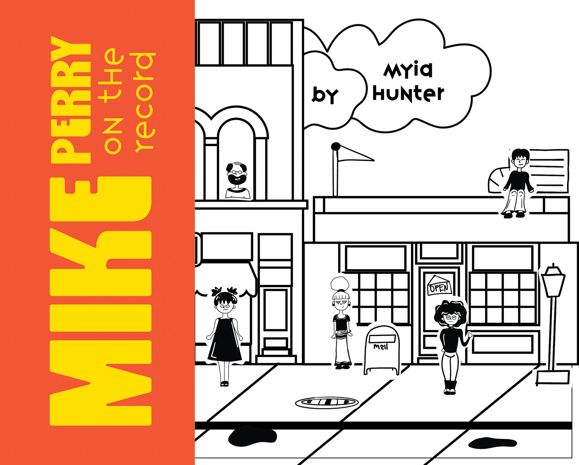
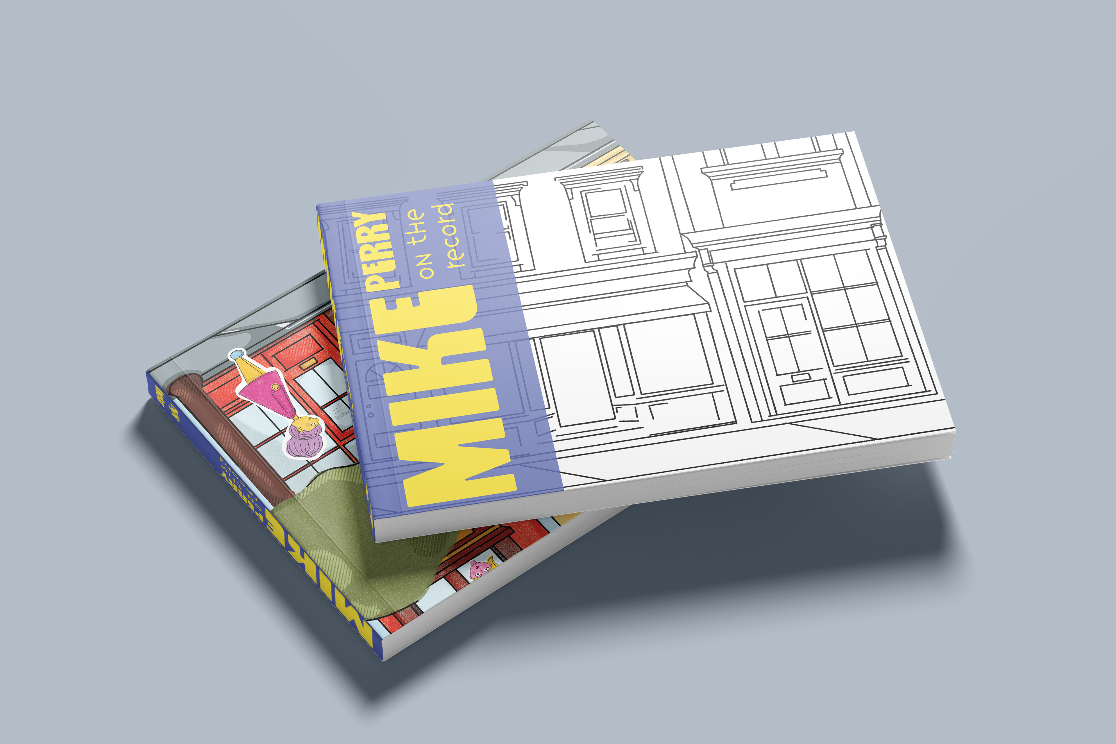
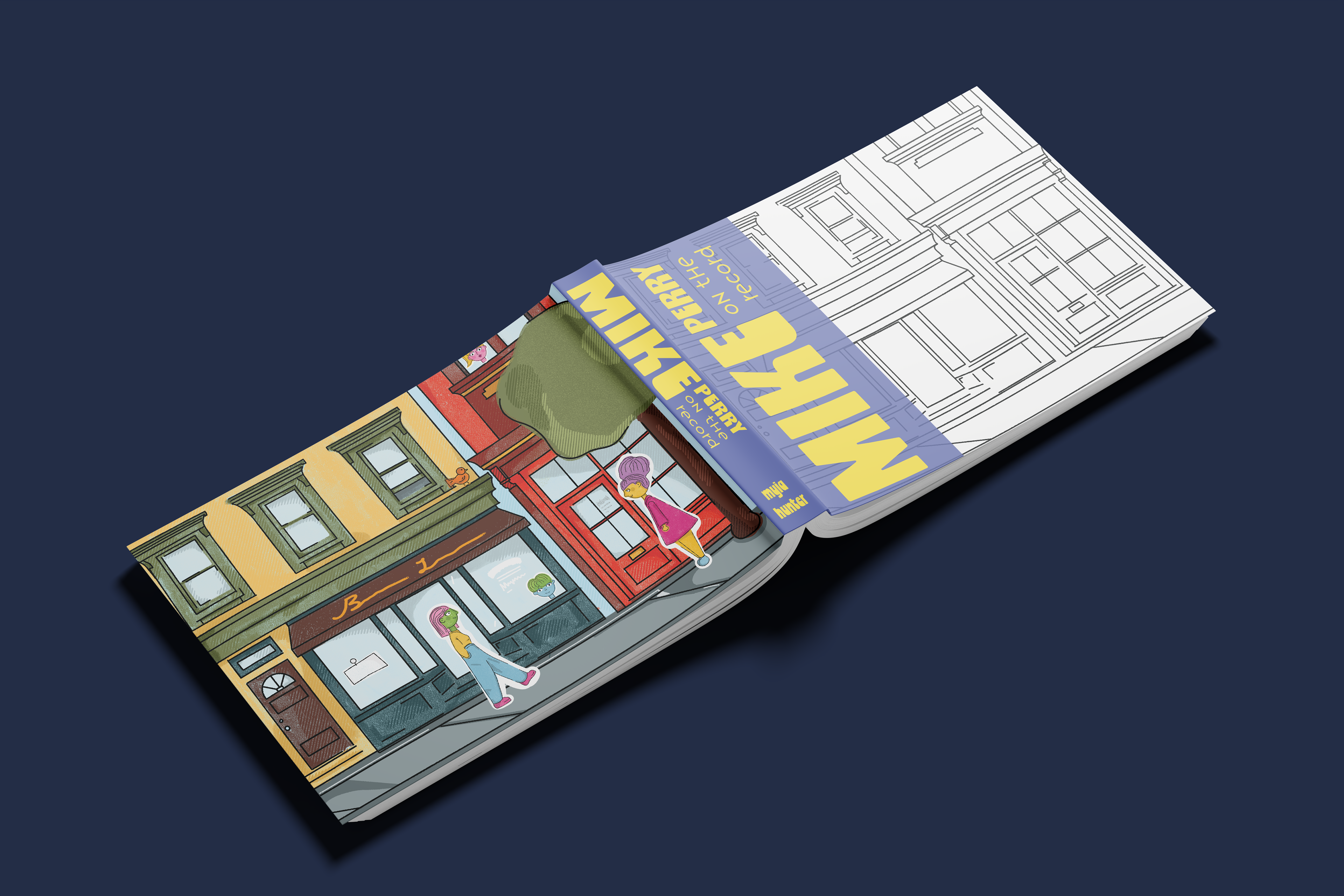
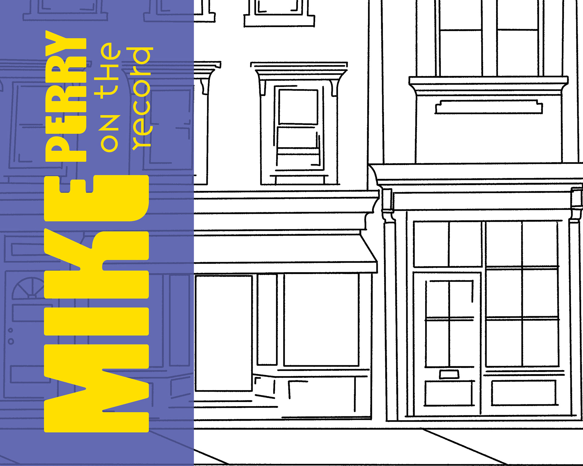
Final Design
For the final design, I chose a painted color-book direction because it felt more appropriate for the overall subject matter of the book. It also created a stronger visual flow from the cover to the content inside.

The Takeaway:
It was interesting trying to navigate making a booklet and cover that emulates Mike Perry's style. I had to play around with different layouts that were fun but didn't sacrifice the readability of the text. Overall, the booklet was successful in providing information about Mike Perry and his expansive works.