

The Task:
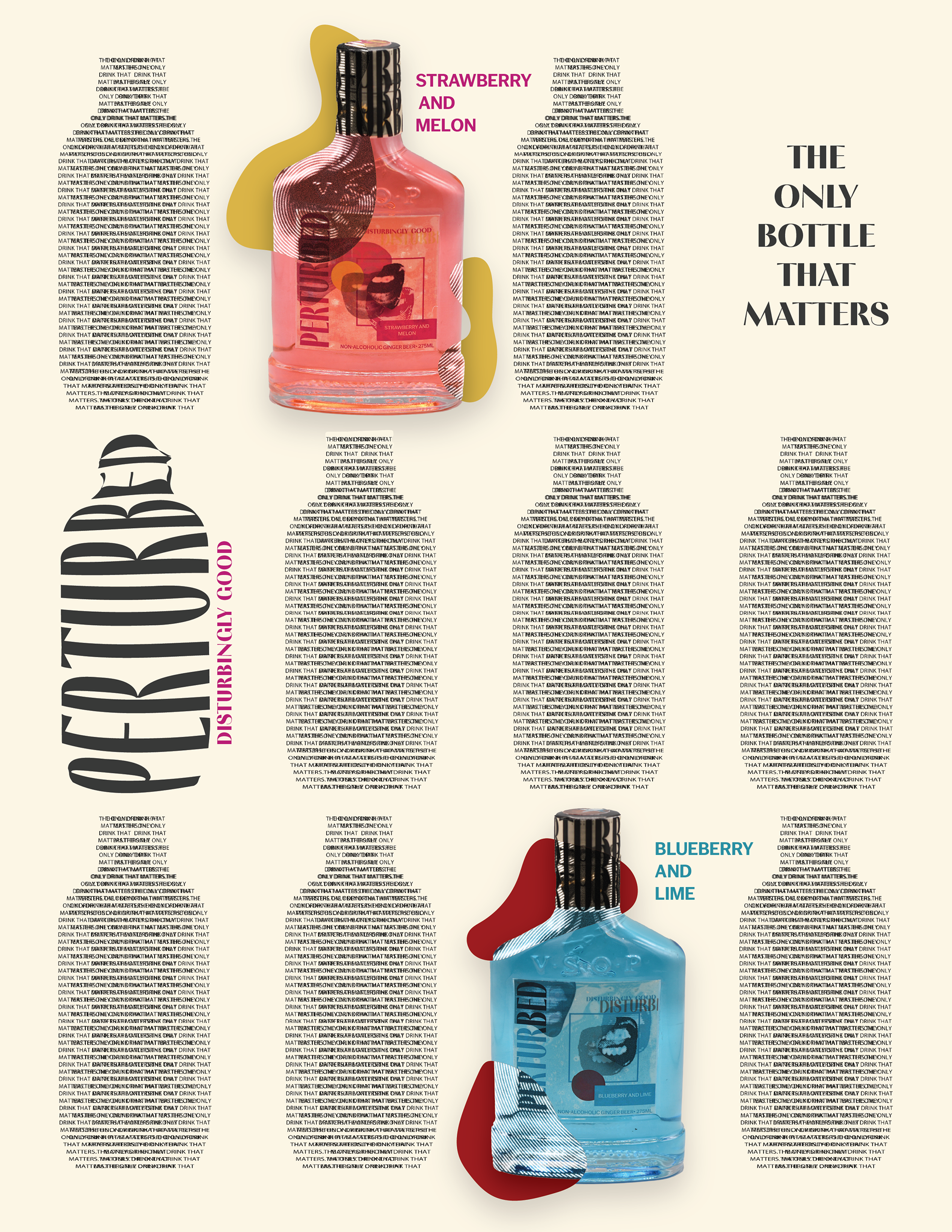
Create a beverage company, then create two bottle label designs and two advertisements for the company's product.
The Subject:
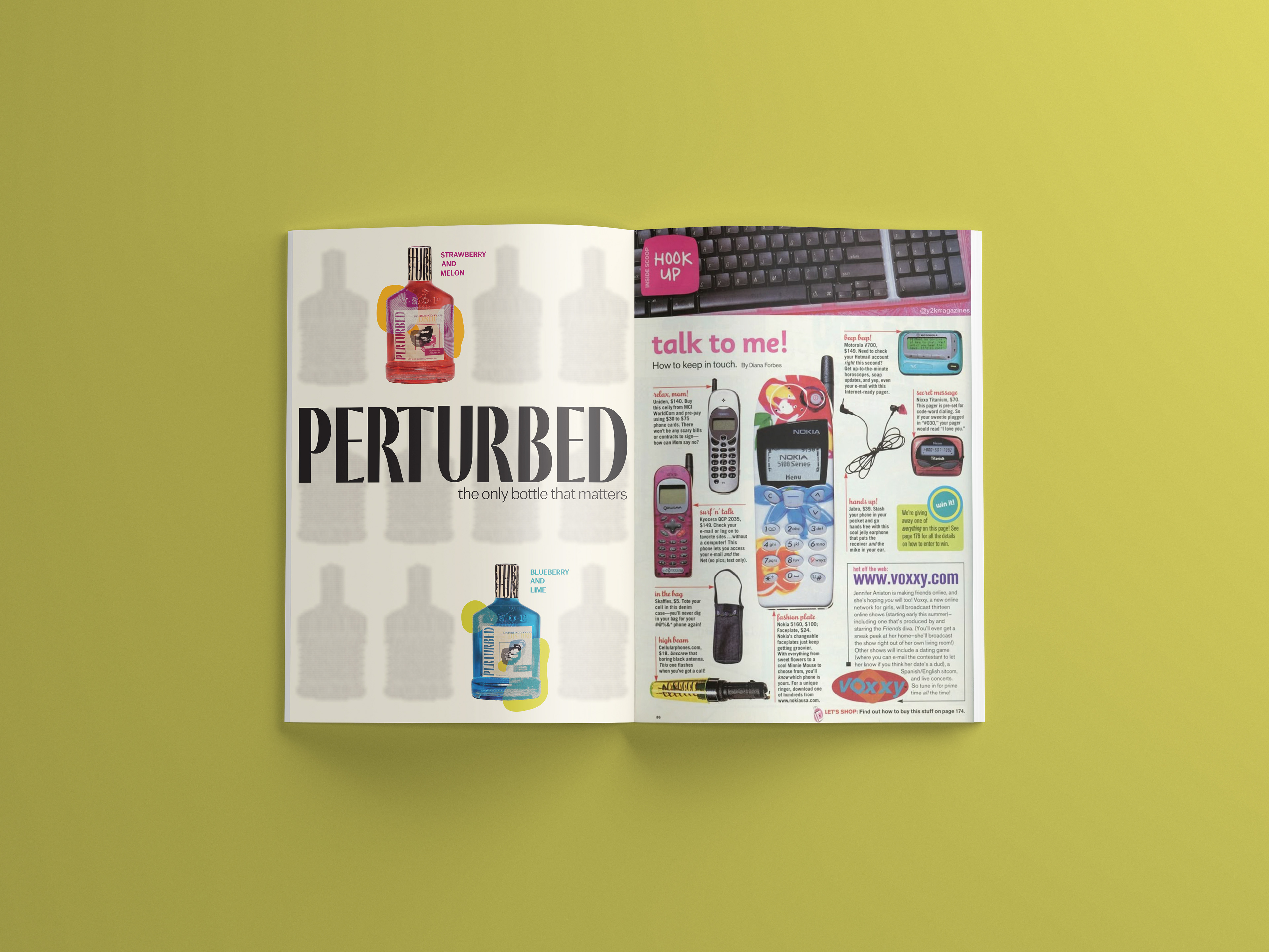
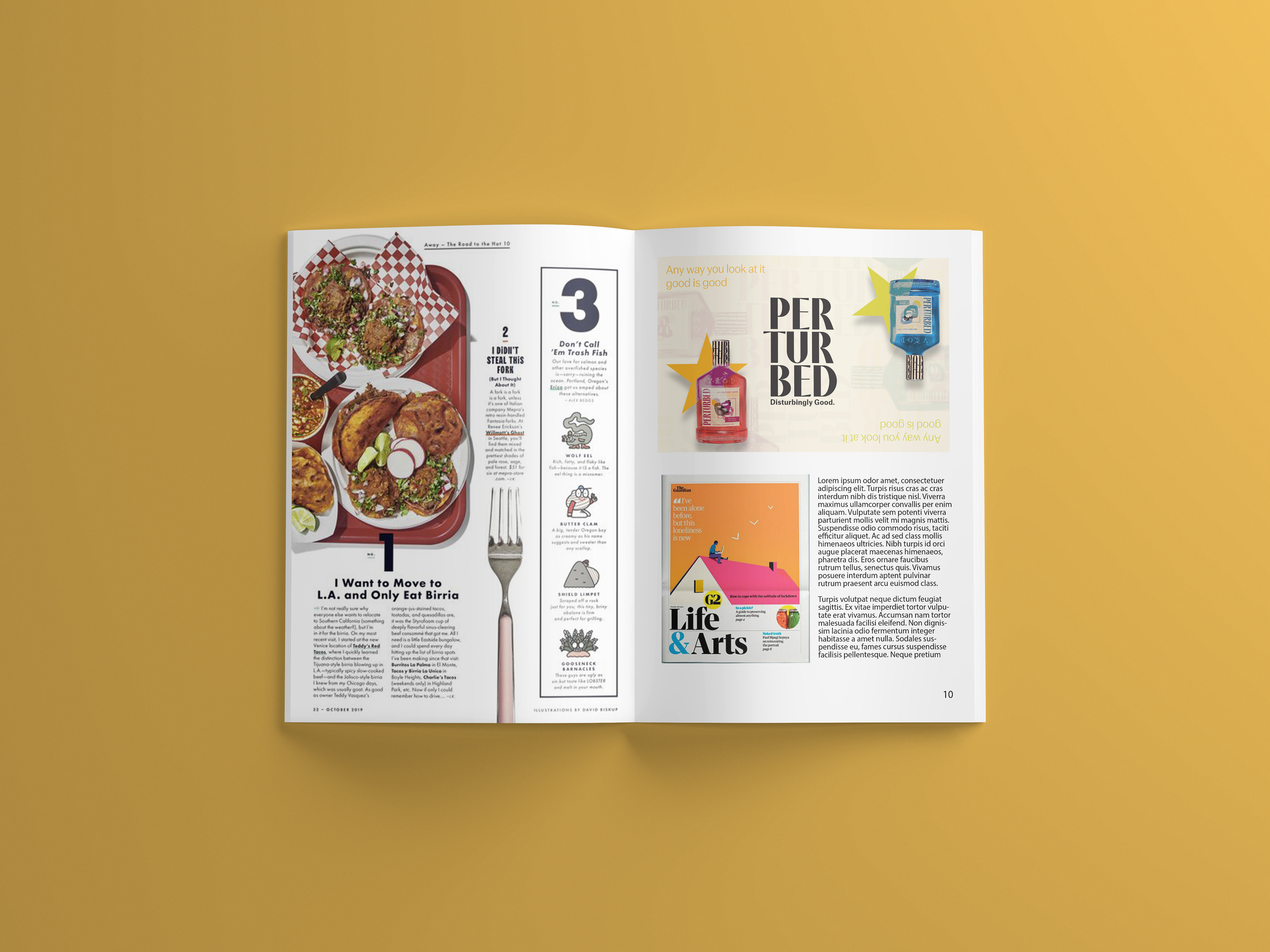
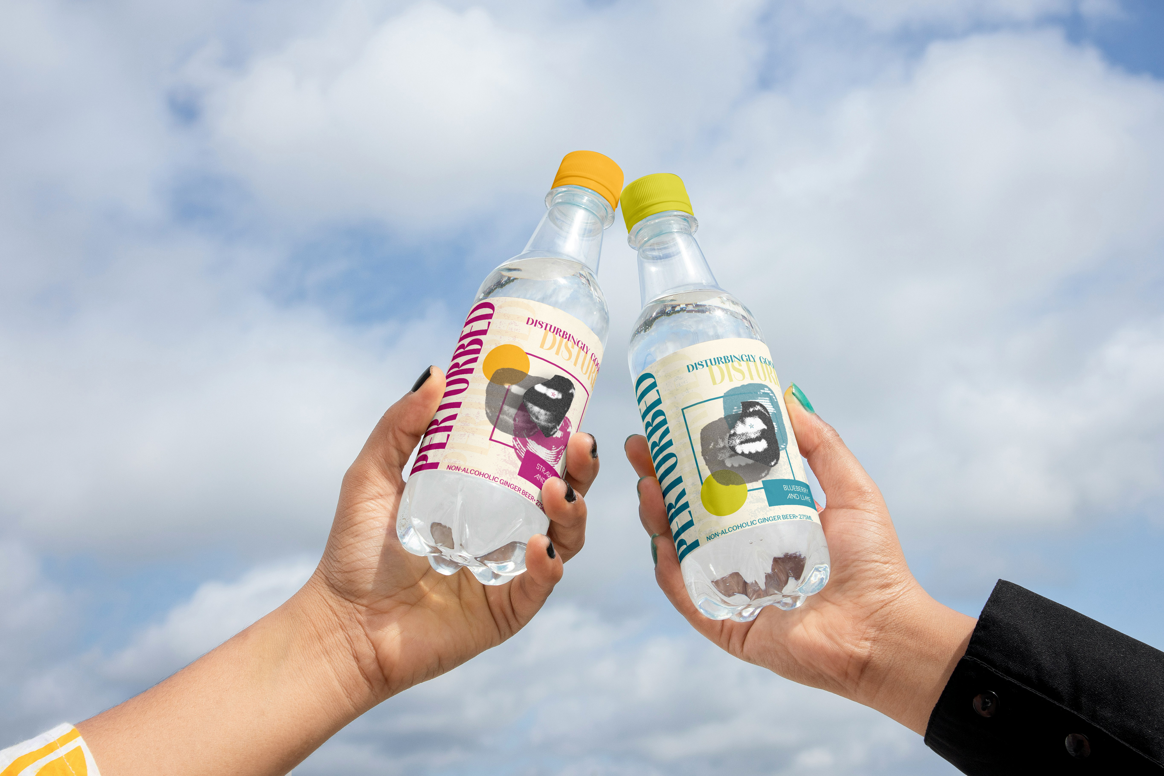
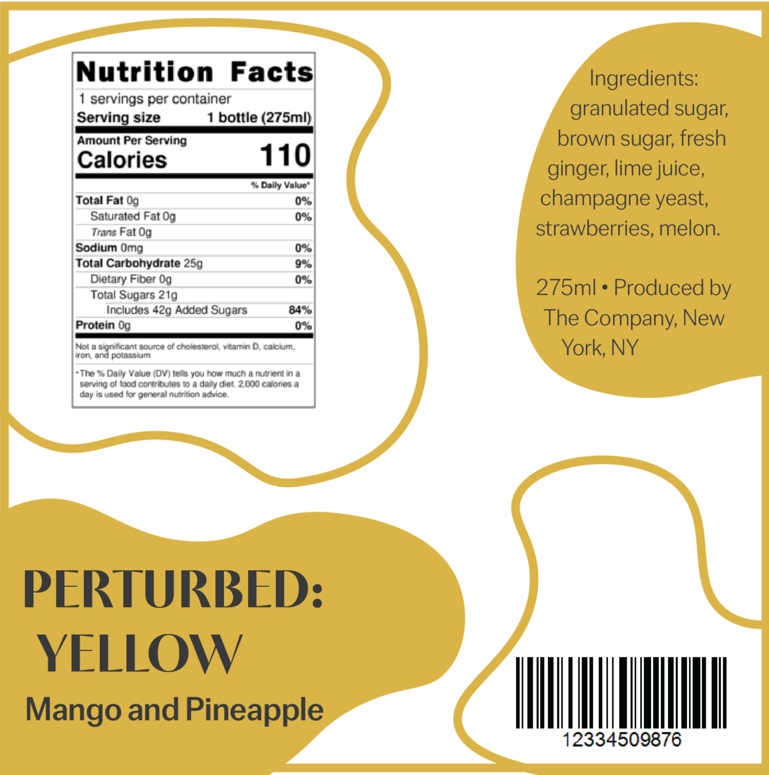
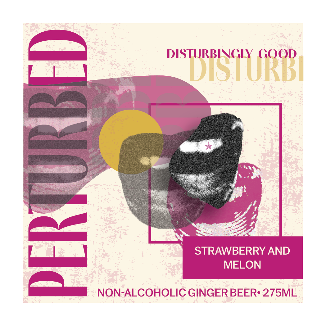
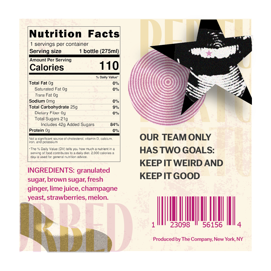
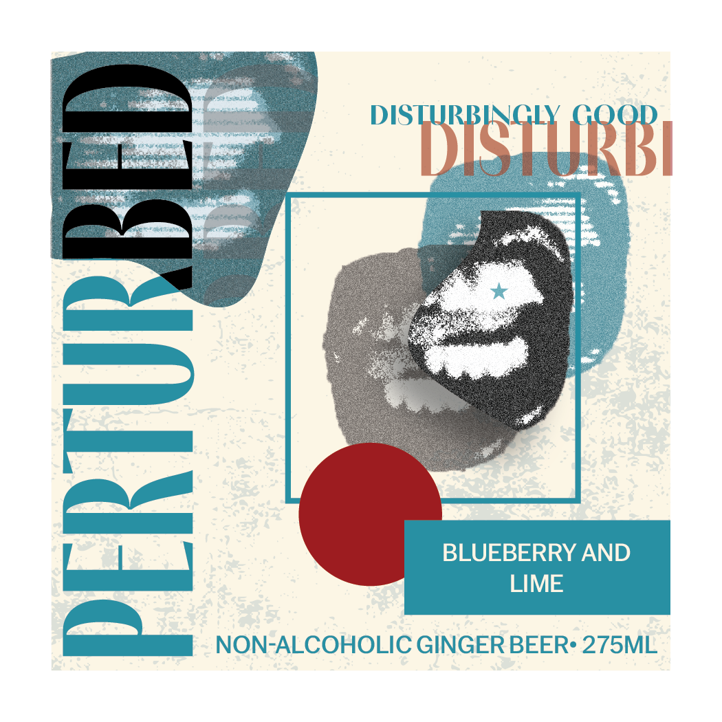
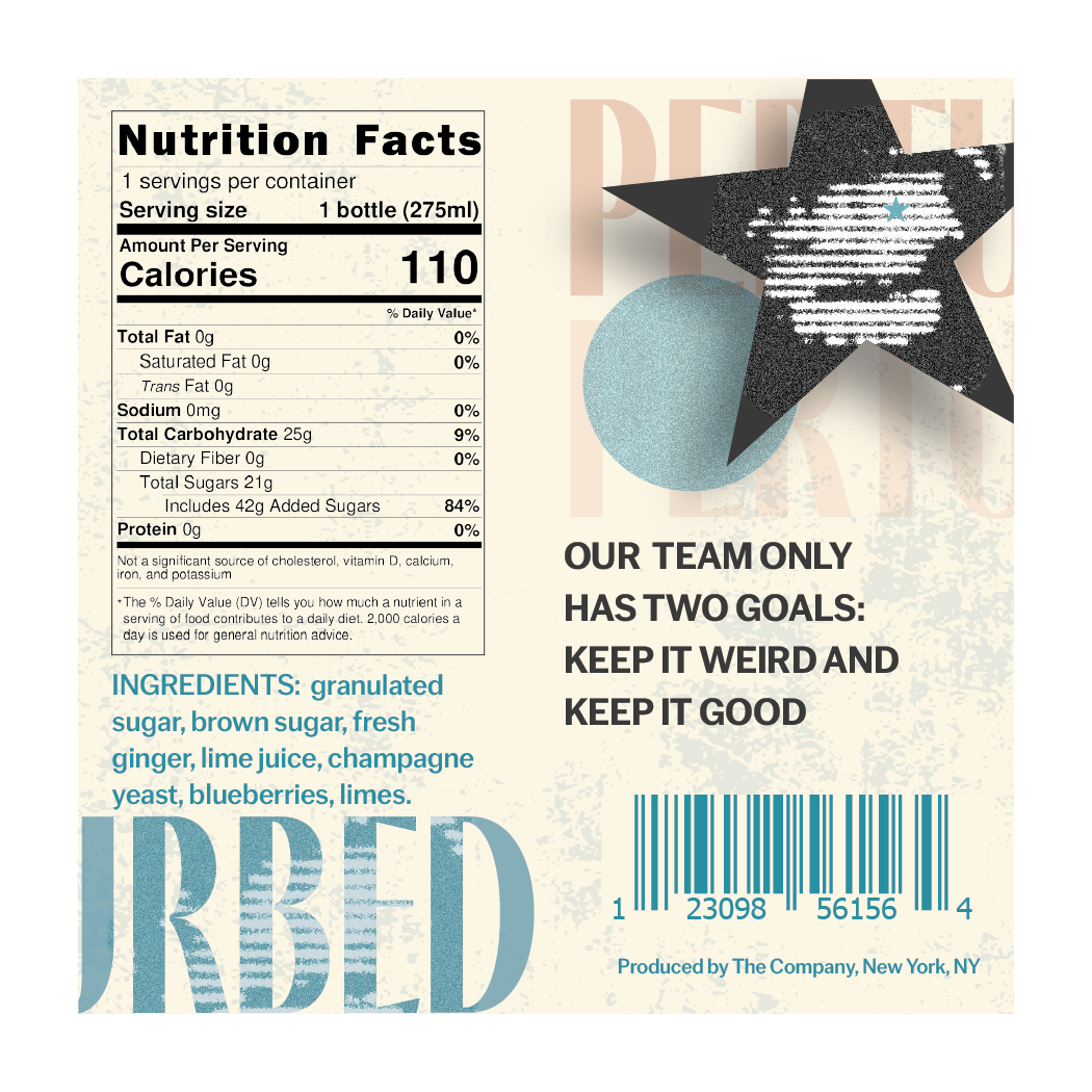
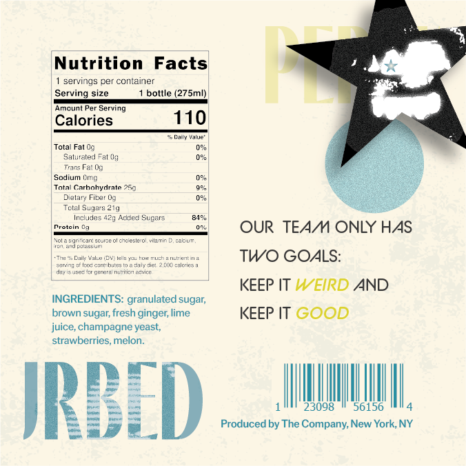
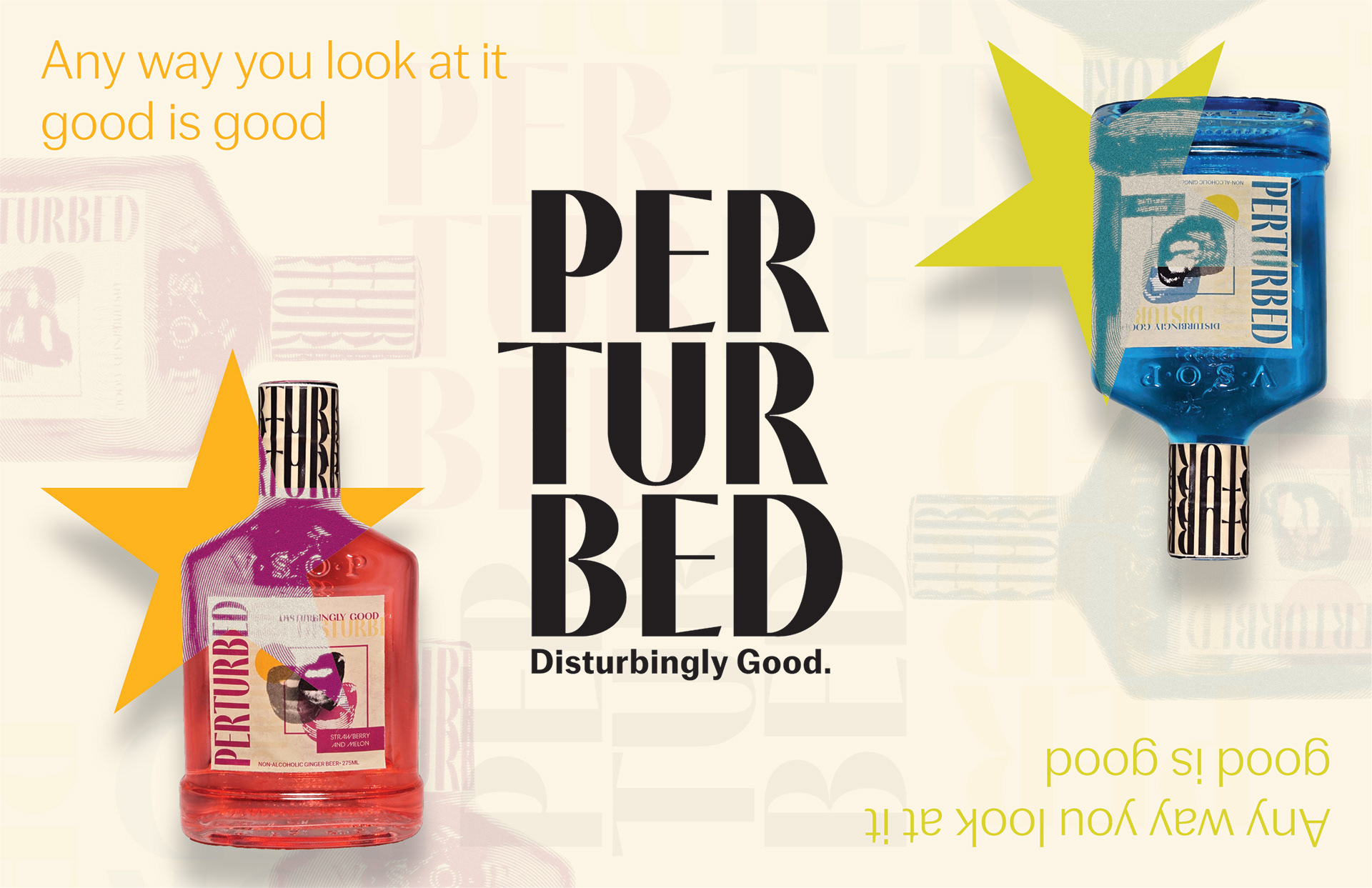
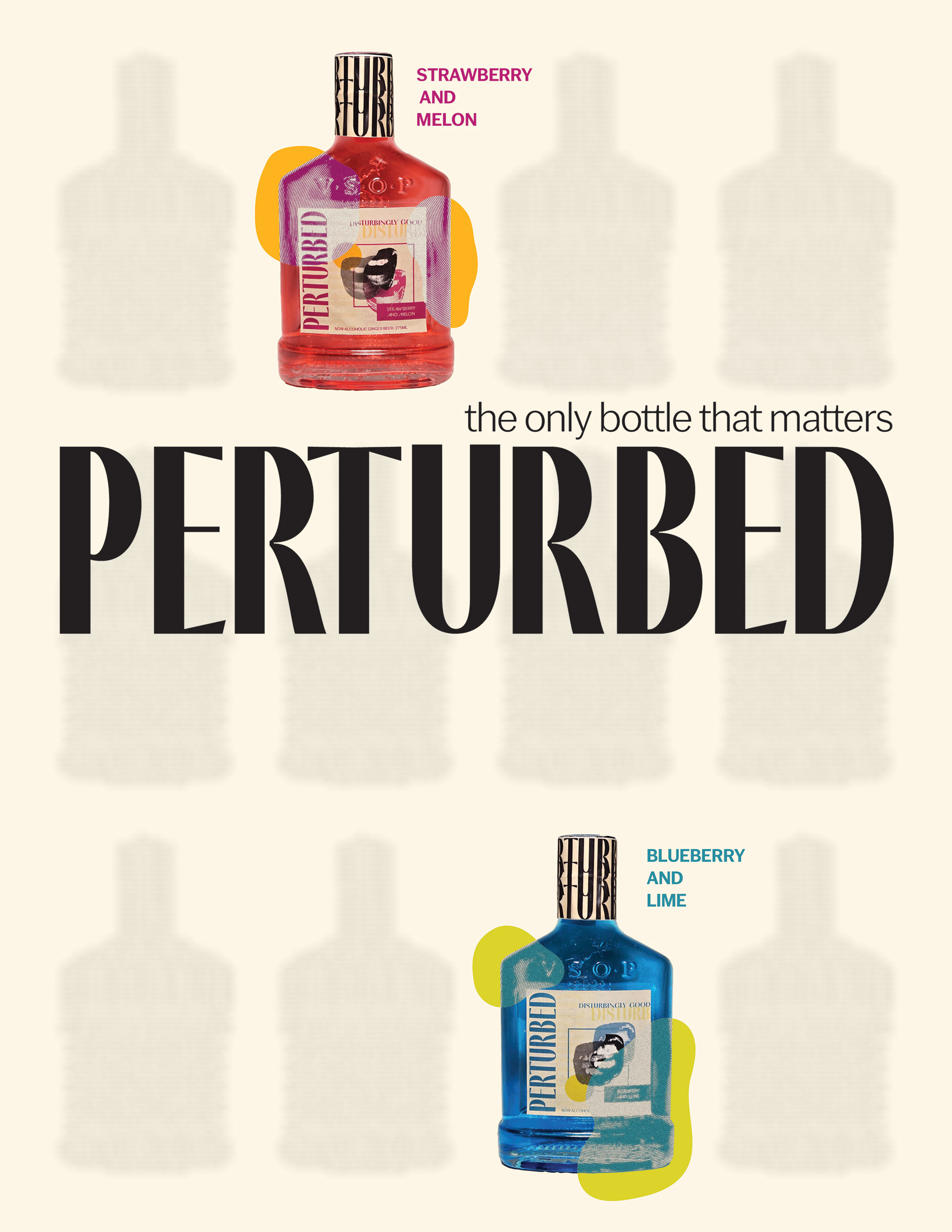
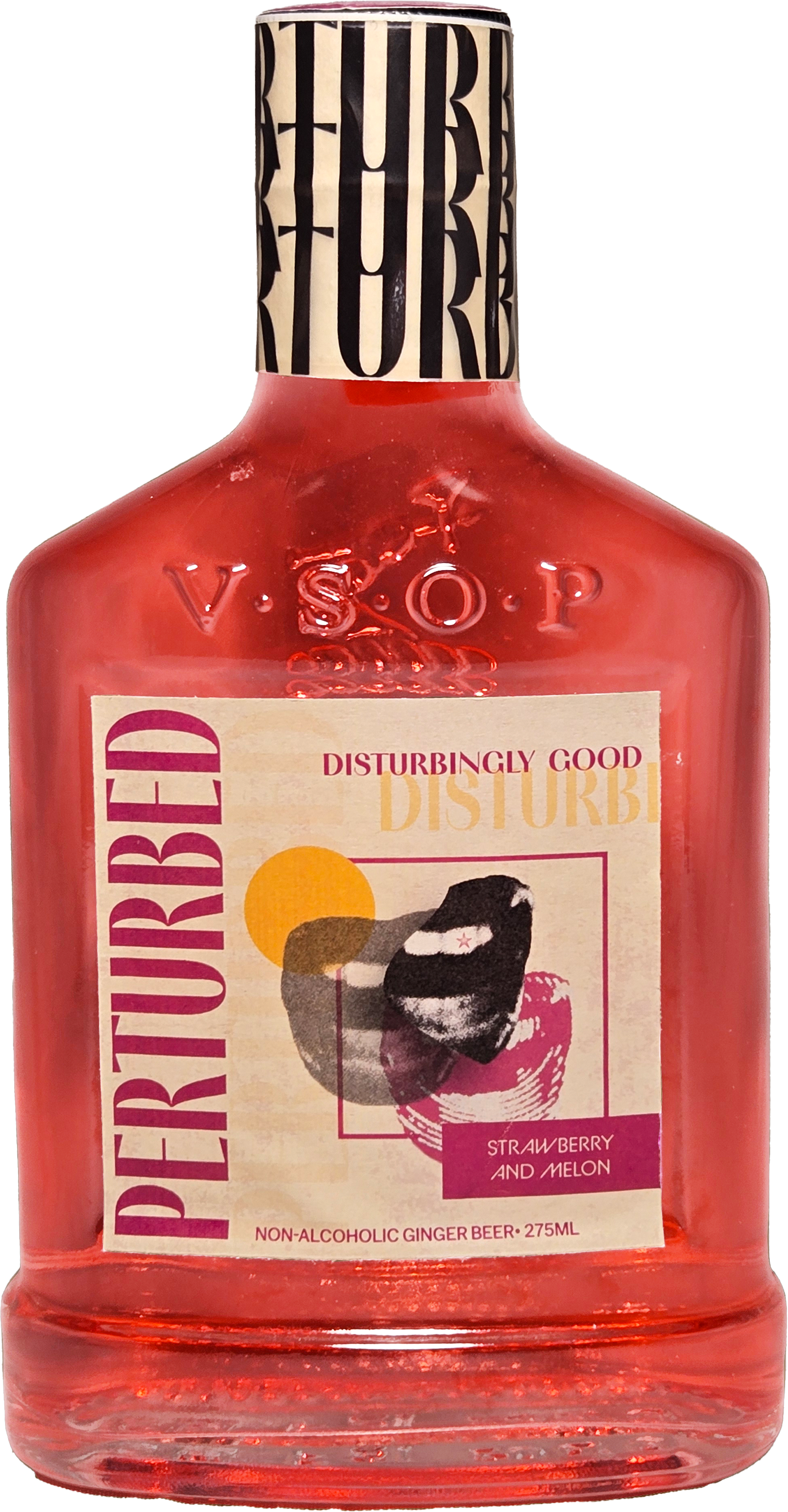
Perturbed, a slightly weird ginger beer company that manufactures a drink anyone can enjoy.
The Approach:
I wanted to create a company that attracts customers who are unique and have an odd taste in things. For the bottle label and magazine advertisements, I wanted to make everything bold. Bold shapes, bold colors, and bold photography.
Typography:
PF Marlet Display
CoFo Gothic
BC Alphapipe
Colors Used:
#fcb420
#b91e75
#2d8ea1
#dcd22c
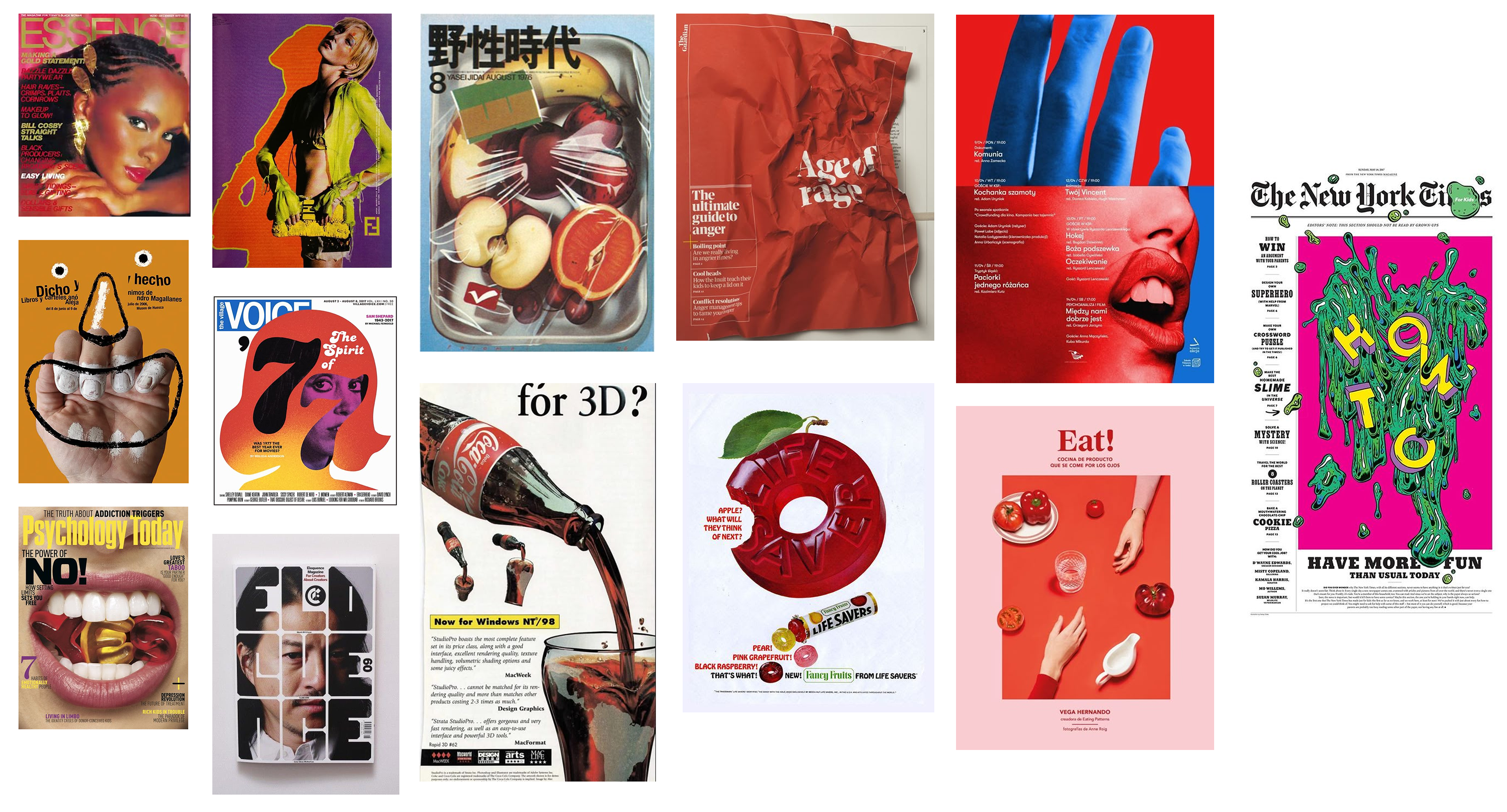
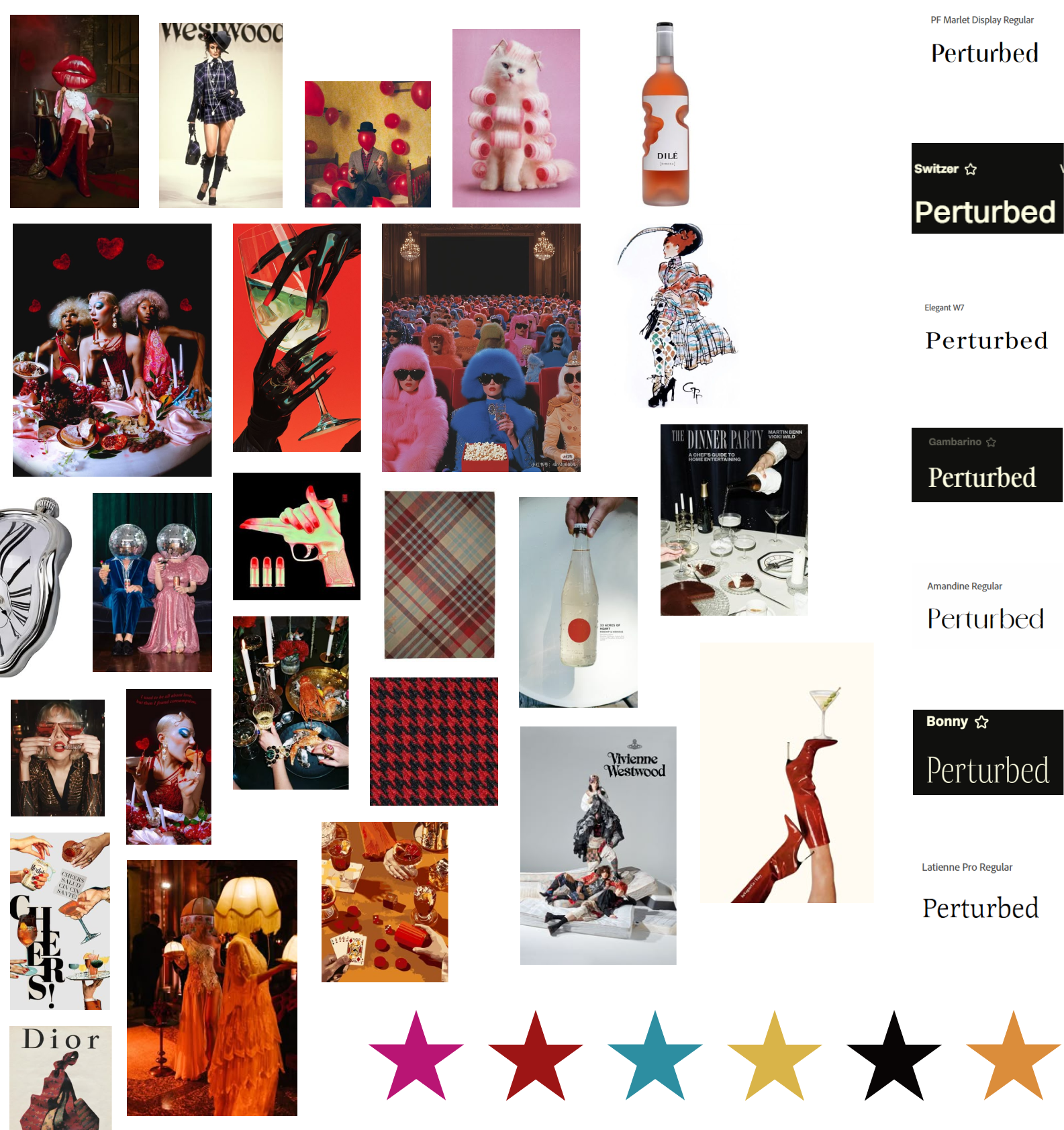
Mood Boards
The next step after conceptualizing the Perturbed brand, was finding images and layouts that are similar to what I want the Perturbed brand image to be: attention-grabbing, eccentric, and bright.
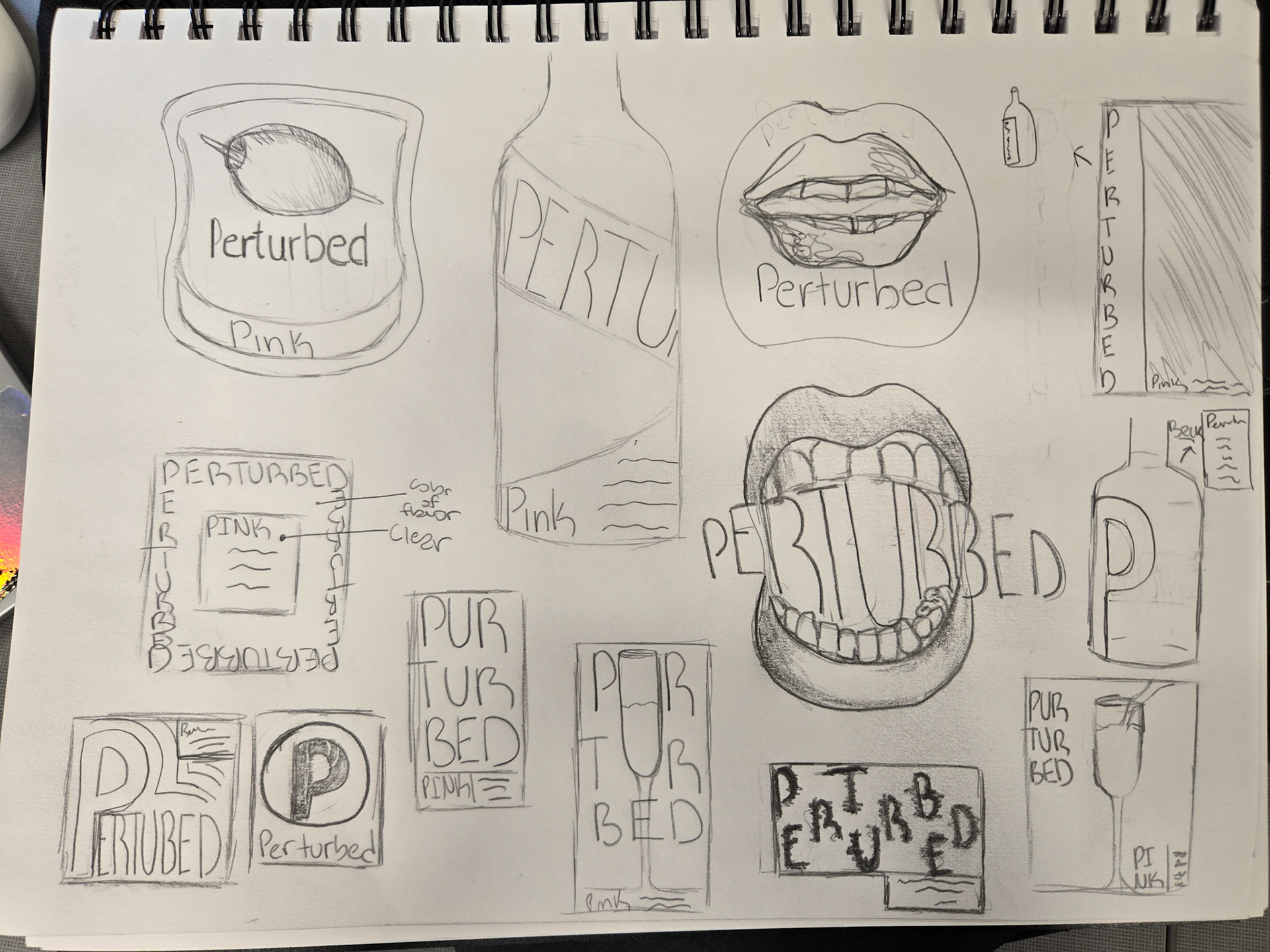
Rough Draft
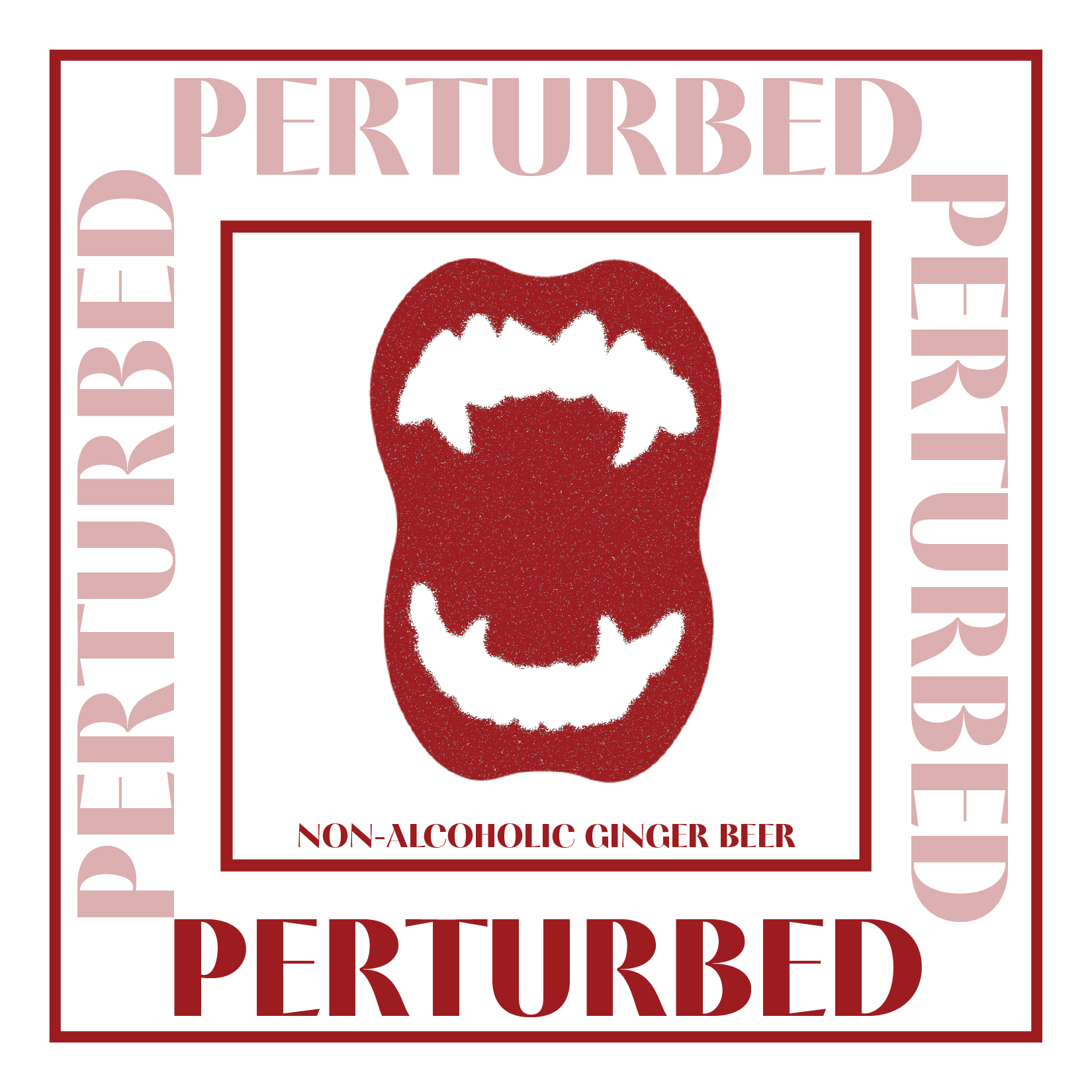
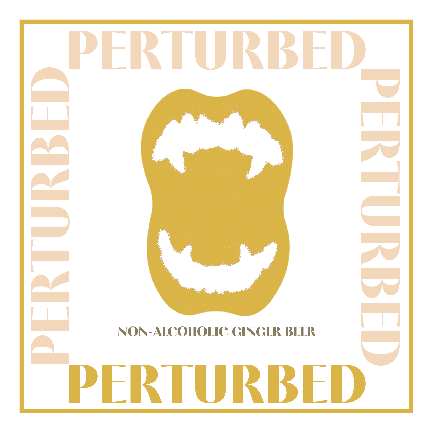
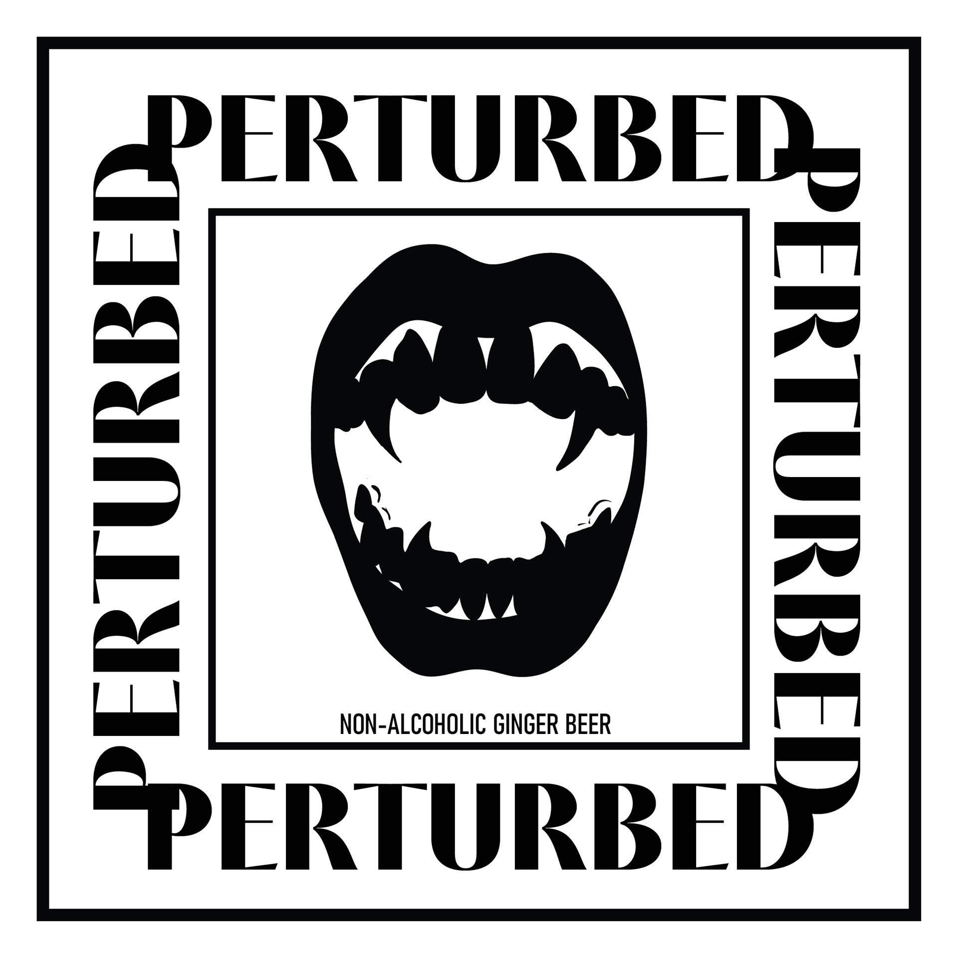
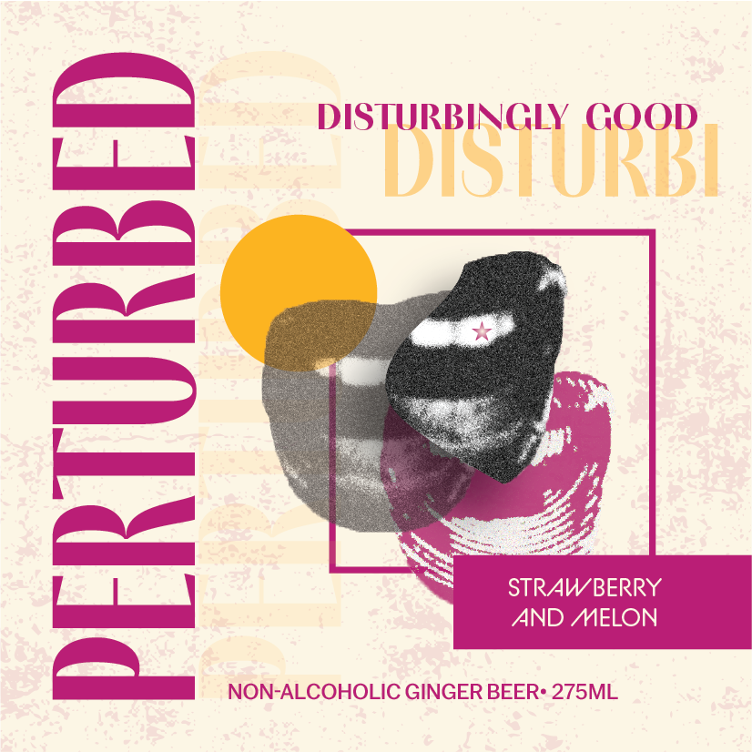
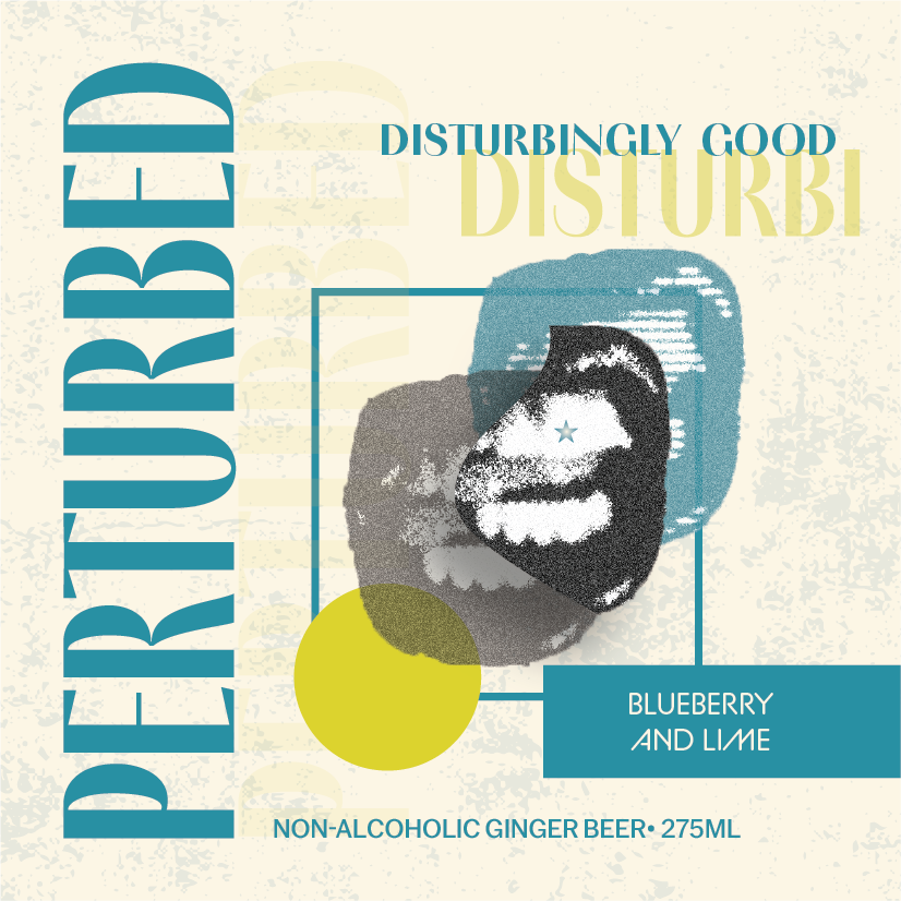
After establishing a design direction, I began creating sketches of bottle labels. I had several different layout ideas but the concept that stuck the most were the labels that included a mouth. I felt that having a mouth in a bottle label could definitely be seen as weird or perturbing, so it became the best option for my brand.
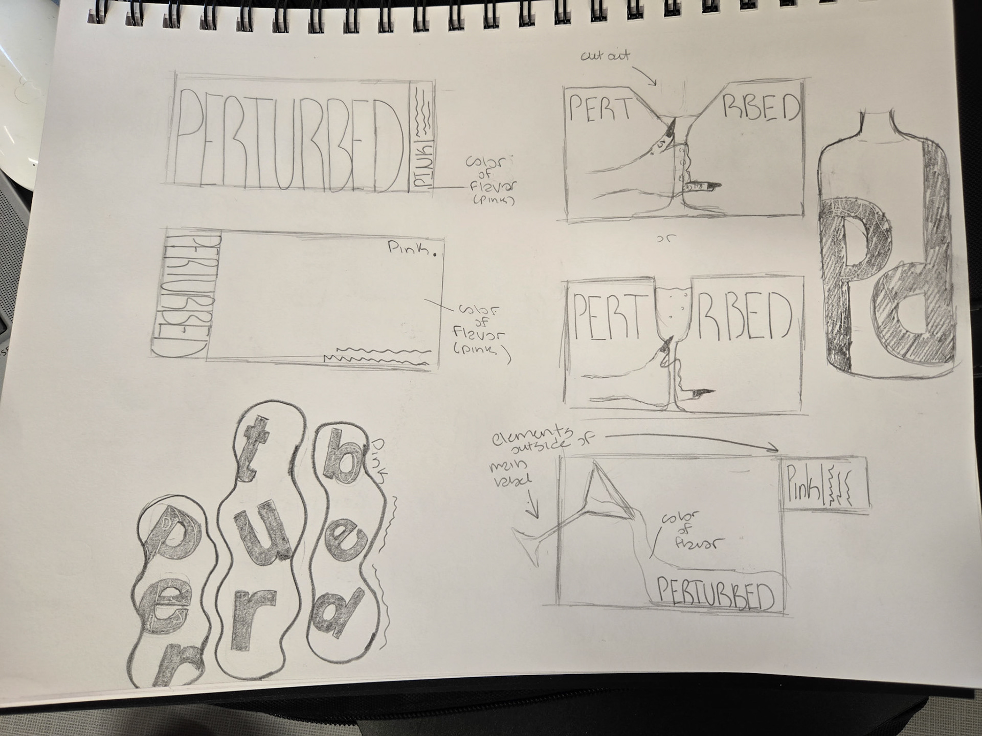
Revised Rough Drafts
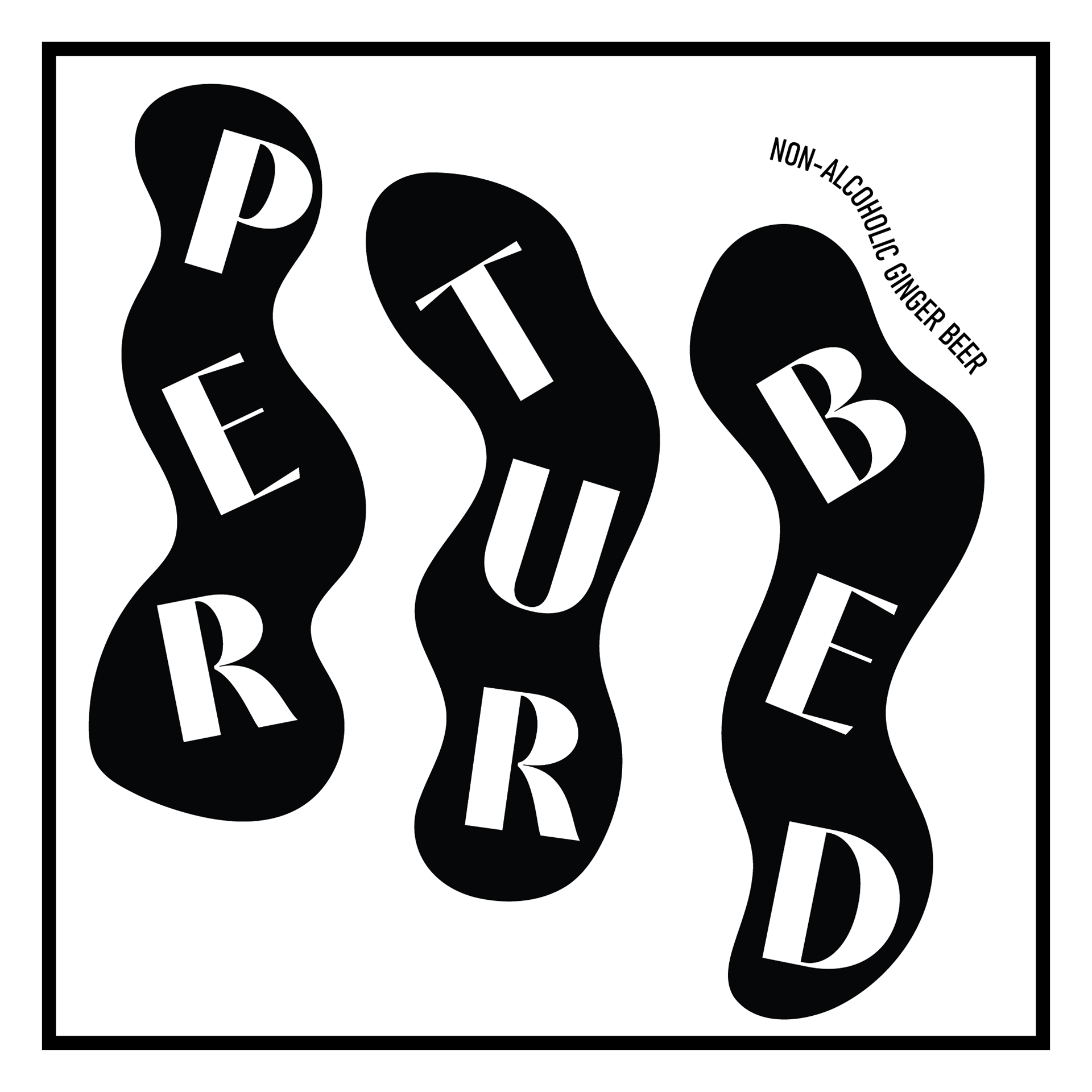
For the first round of digital drafts, I played around with type orientation and using irregular shapes. Although I was a big fan of the mouth concept, I felt as if the mouths were out of place and didn't go with the back of the label.
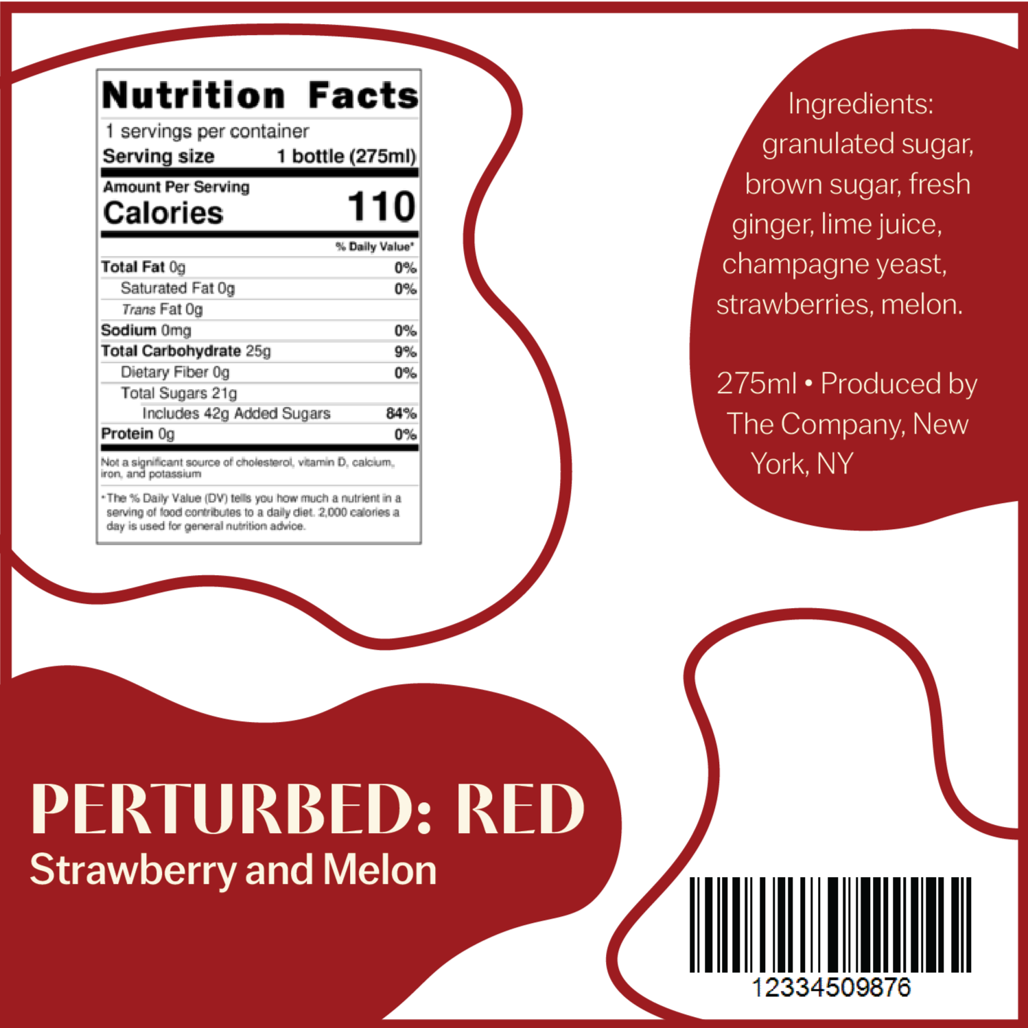
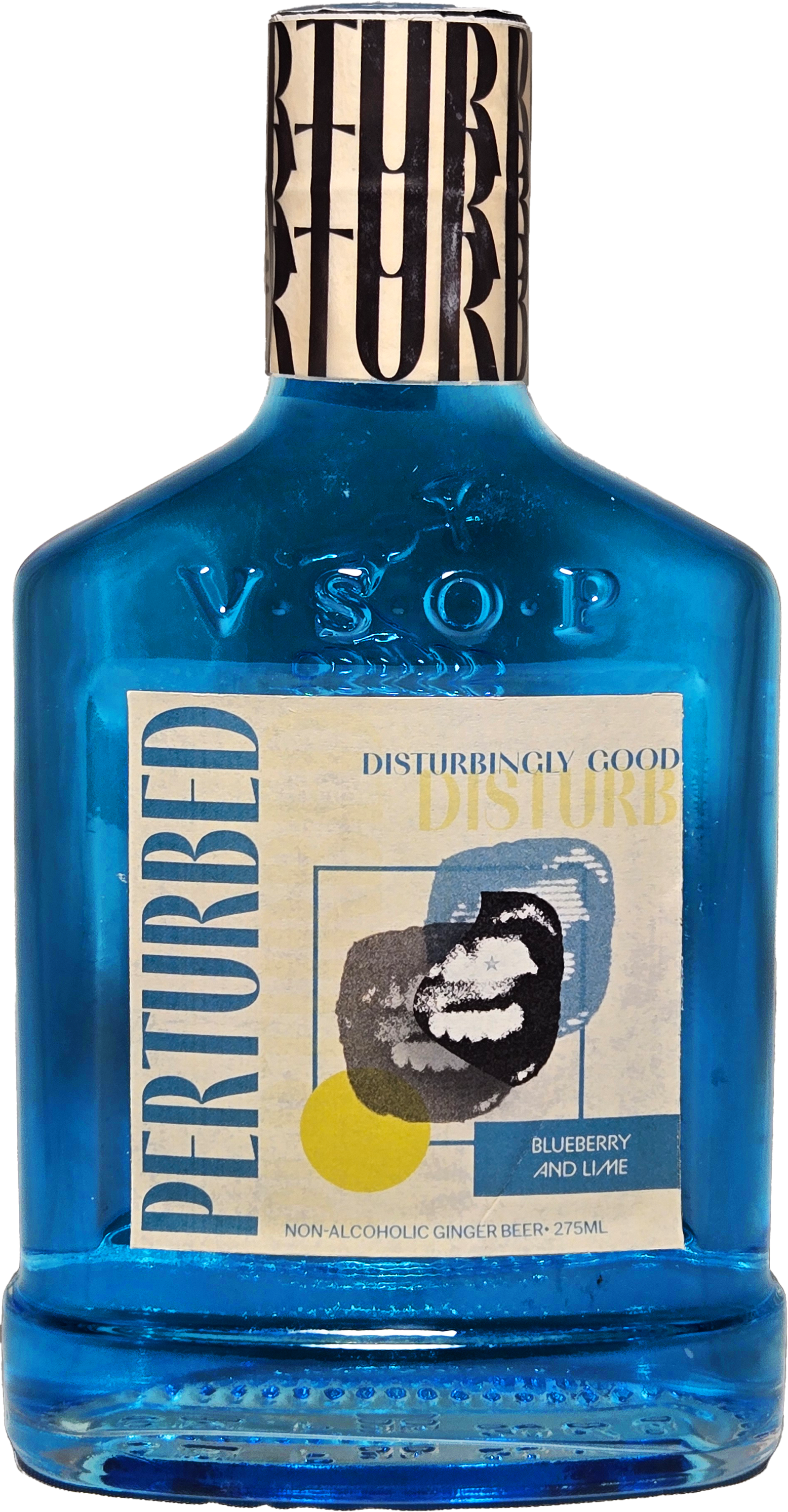
Revised Label and Ad Design
In the revised label designs, I pivoted my approach from illustrations to photography. Doing so made the brand more established and eccentric. I also utilized stripes, shapes, and other patterns to help add another layer of uniqueness to the designs.
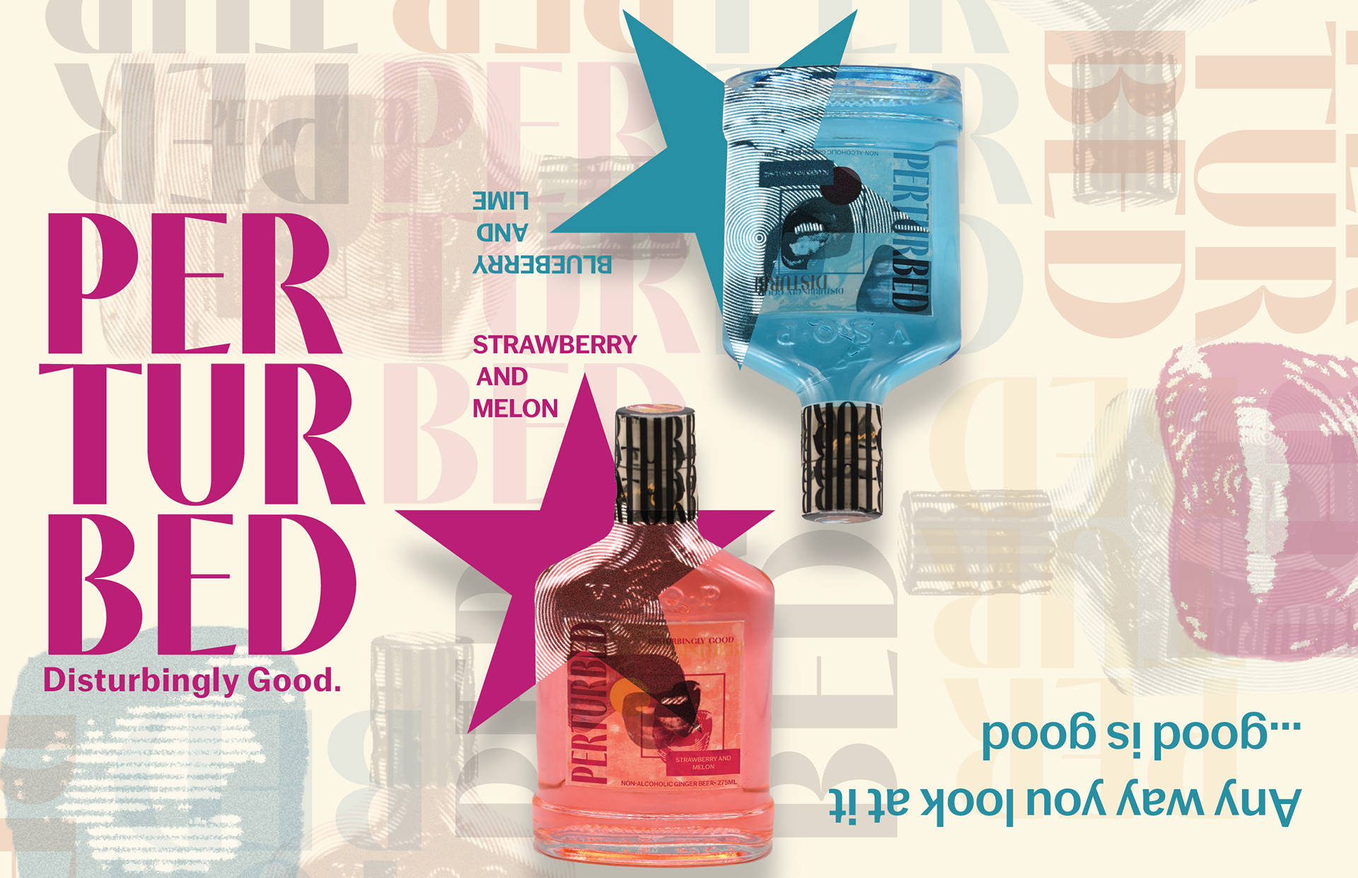
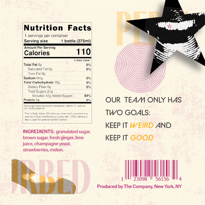
Final Label and Ad Design
In the final designs I changed the label accent colors from red and yellow to a brighter yellow and green. These new accent colors complimented the drink names better, and added another level of brightness to the designs. For the advertisements, I altered the type hierarchy so that it was more readable.

The Takeaway:
Although this project was challenging at first, shifting the approach from illustrations to photography made the concept more cohesive. In the end, the bottle label and magazine advertisements successfully delivered bold, attention-grabbing visuals that would appeal to the target audience.