

The Task:
Redesign a city's branding system and create a campaign that would entice people to visit by designing a new logo, icons, and branding pieces.
The Subject:
New York City, a densely populated and diverse city that has many attractions.
The Approach:
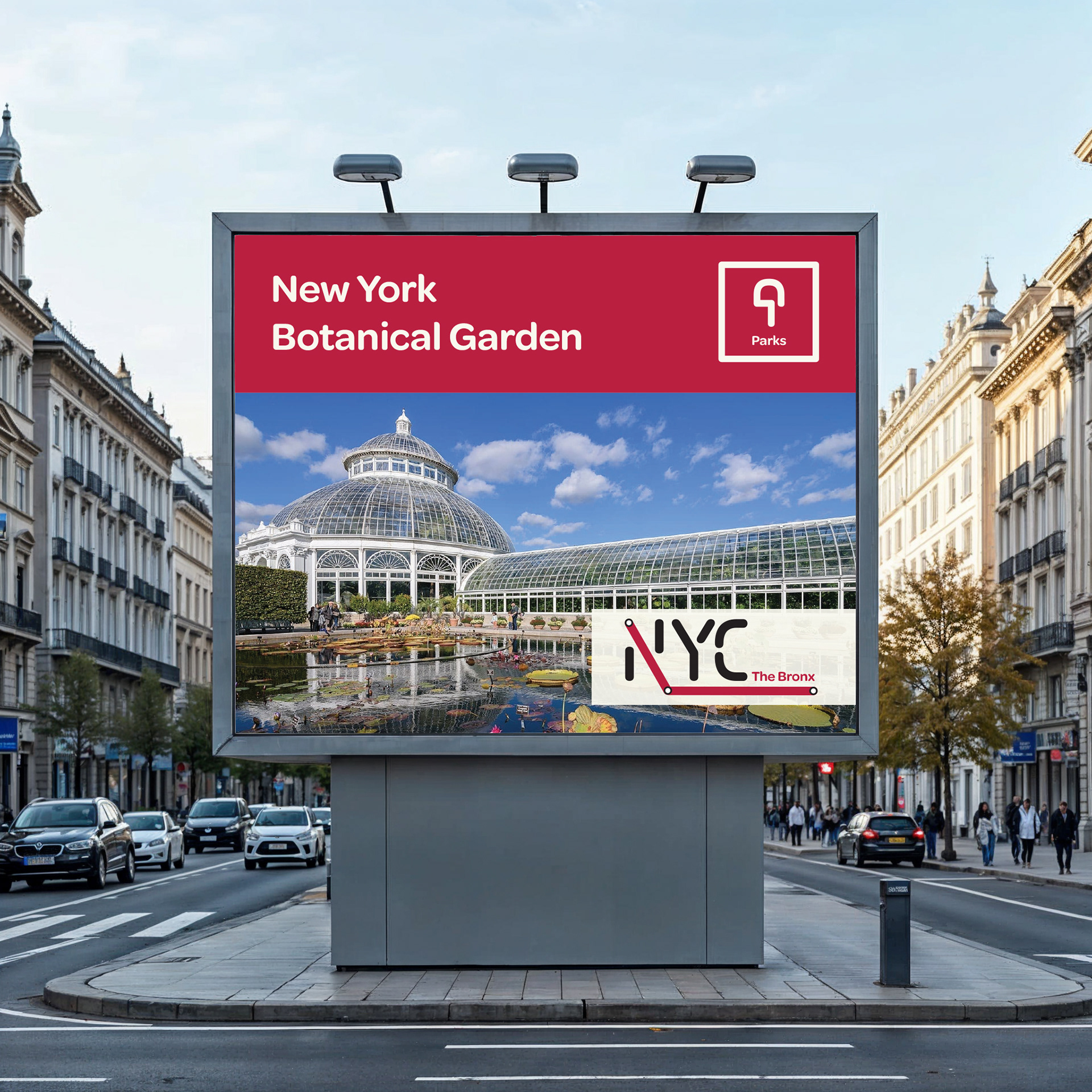
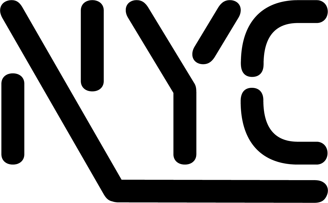
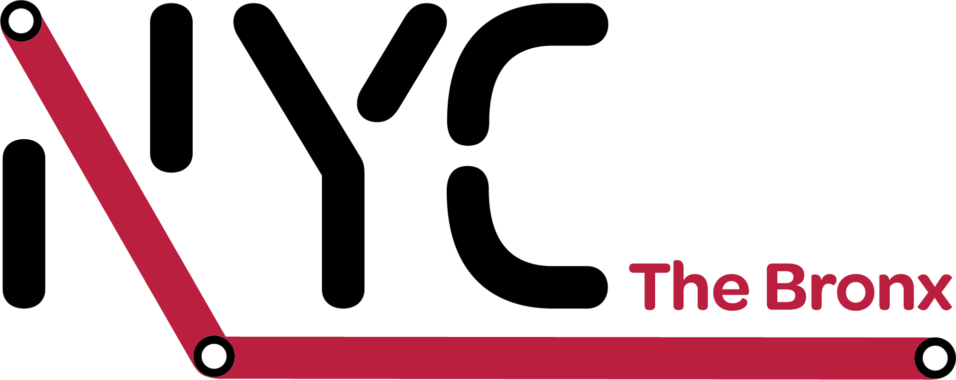
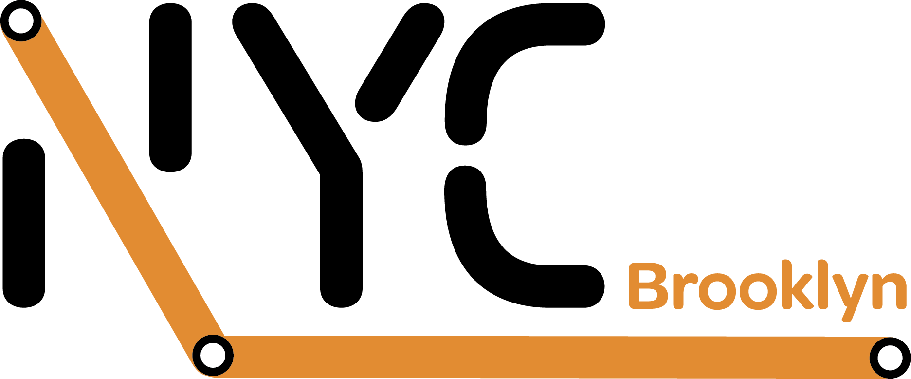
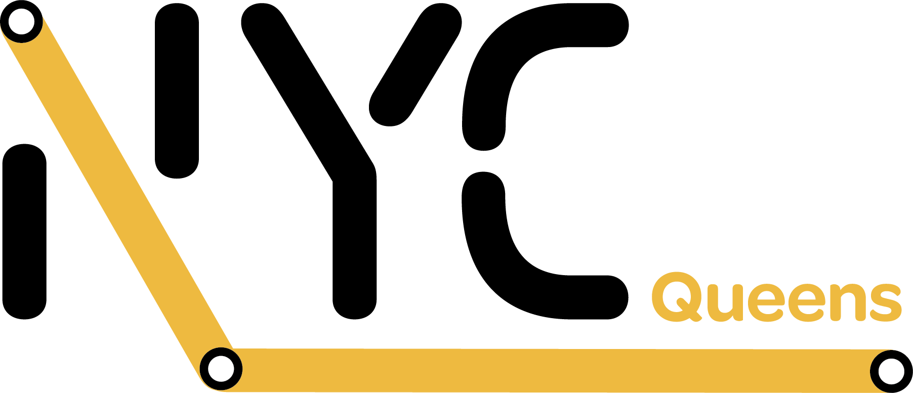
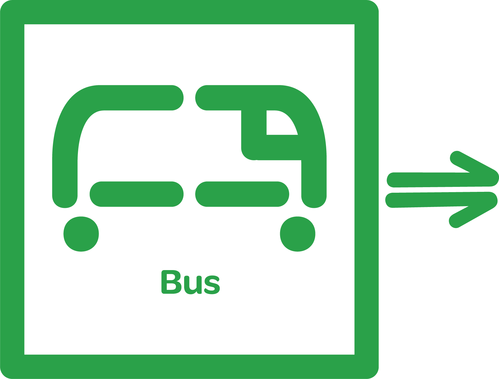
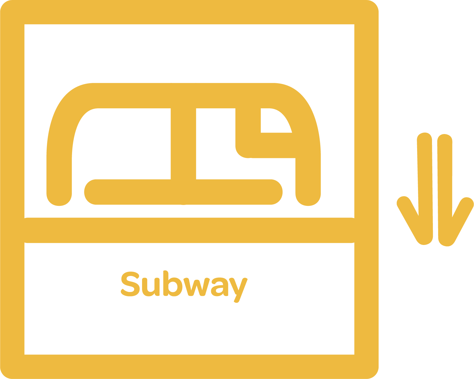
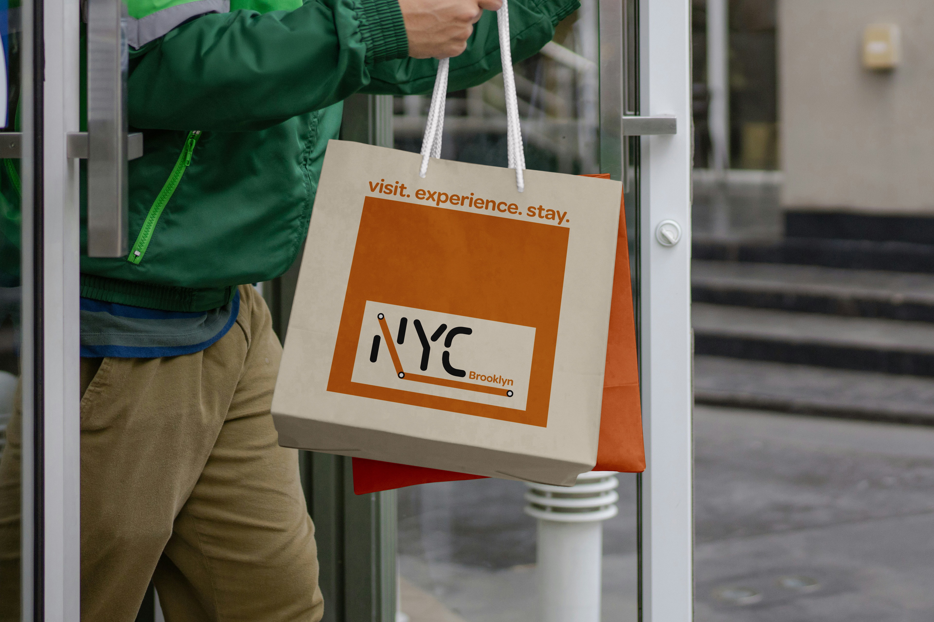
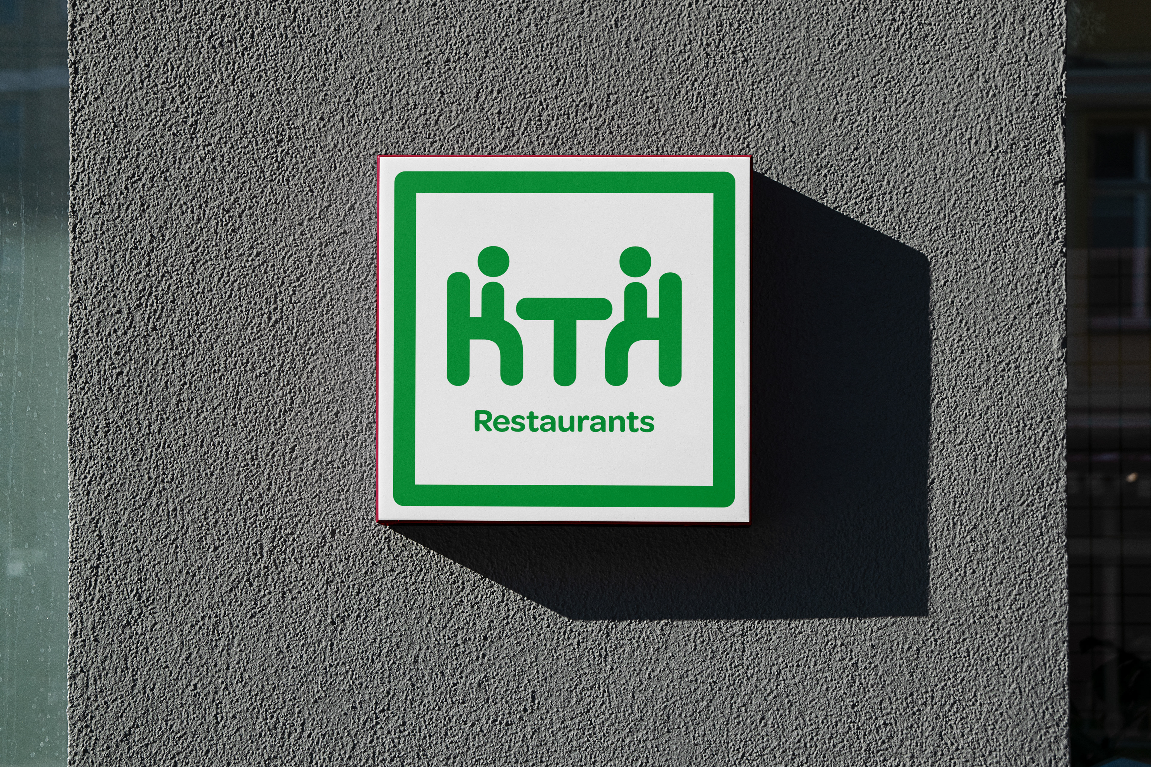
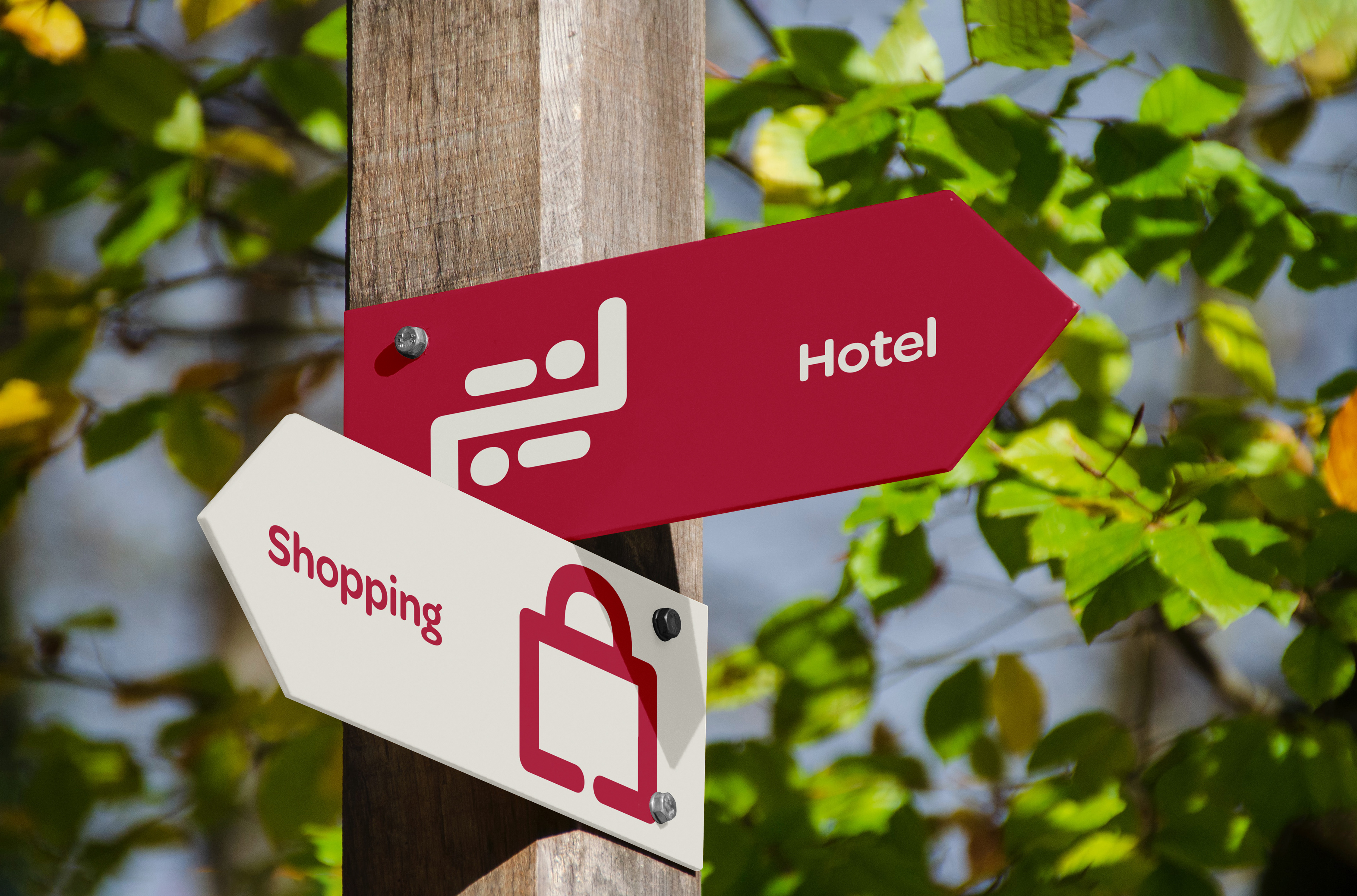
Since New York City is made of five boroughs ( Manhattan, Queens, The Bronx, Brooklyn, Staten Island), I wanted to create something that would be versatile and allow for specific borough branding. Inspired by the NYC subway system, I decided to use the same bright colors and rounded shapes that can be found on an average NYC subway map.
Typography:
Kola
Omnes
Colors Used:
#f8f5ec
#b91f40
#7277b8
#2ea048
#e28c31
#ecb940
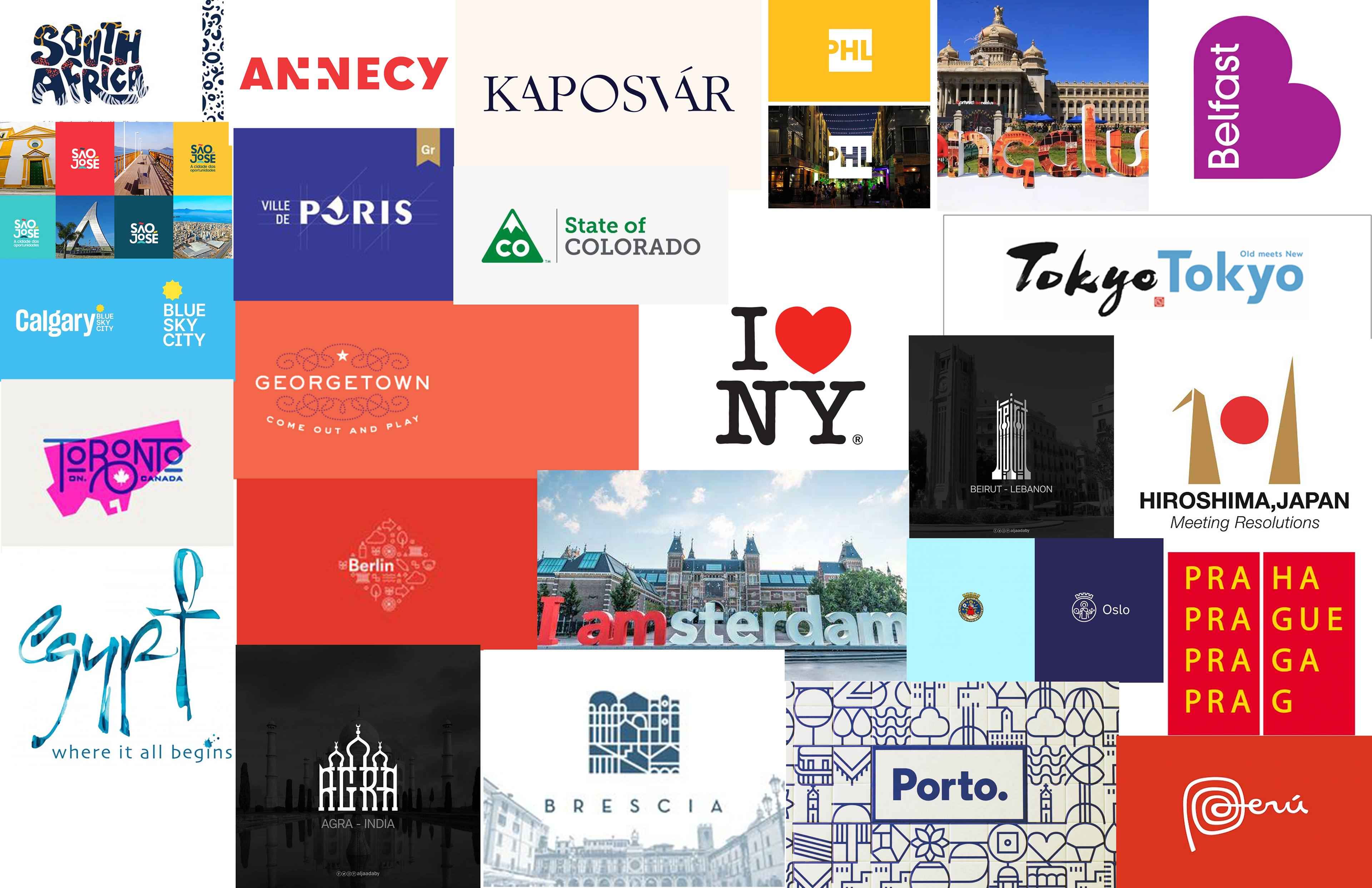
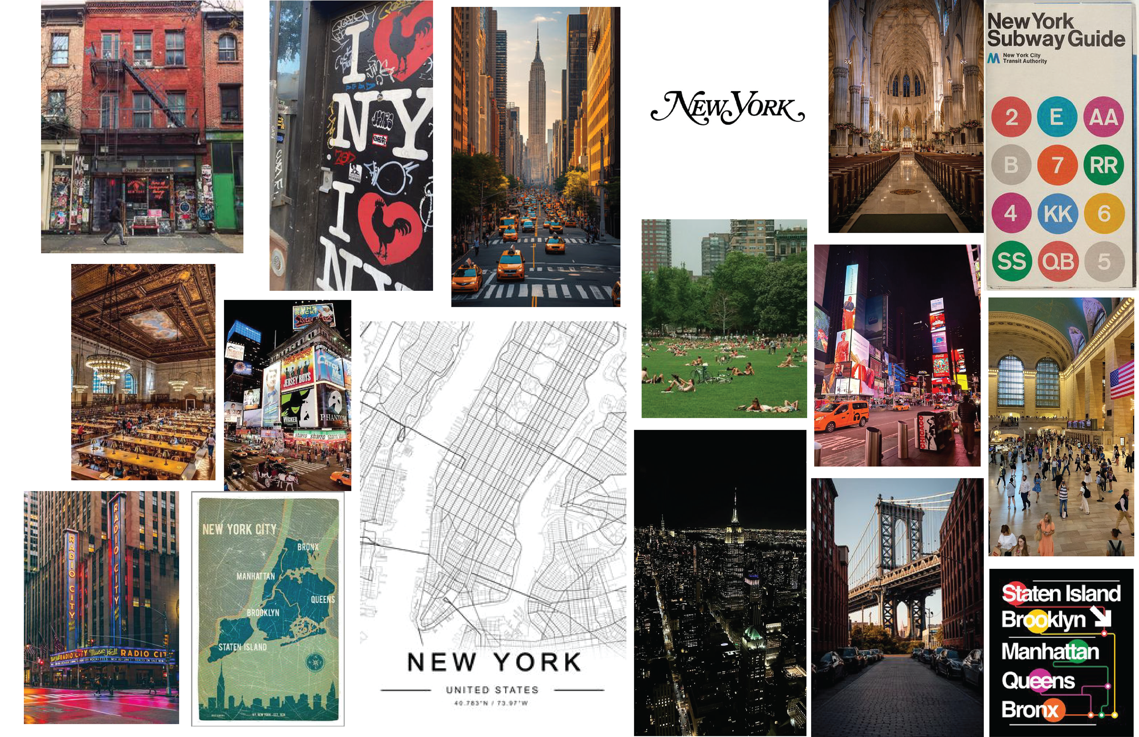
Mood Board
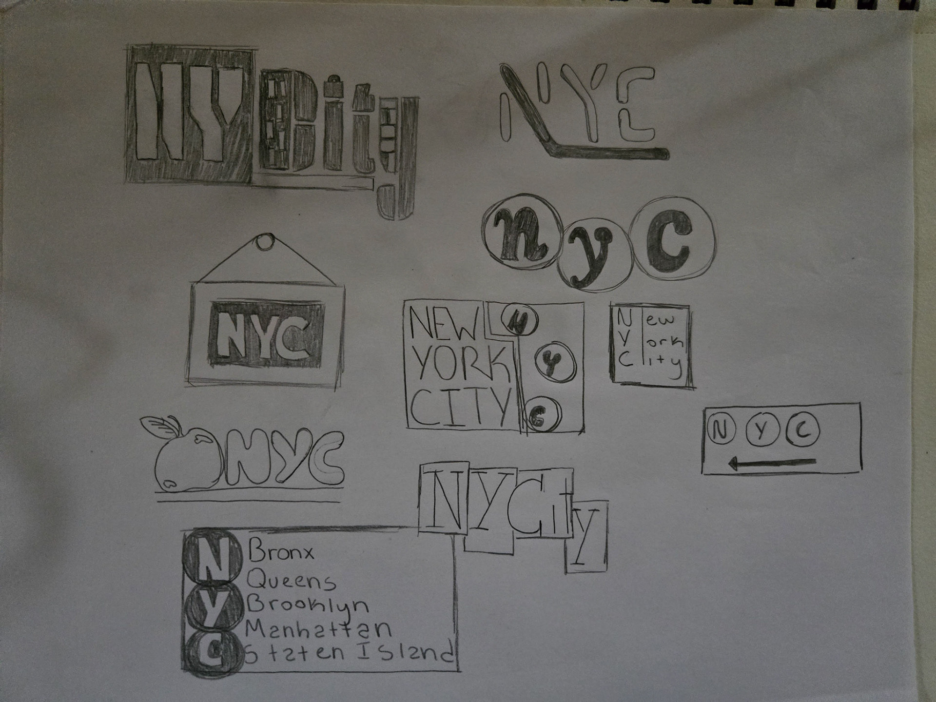
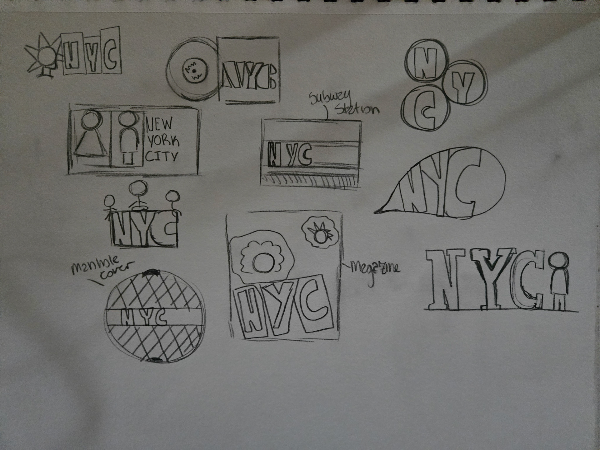
Rough Drafts

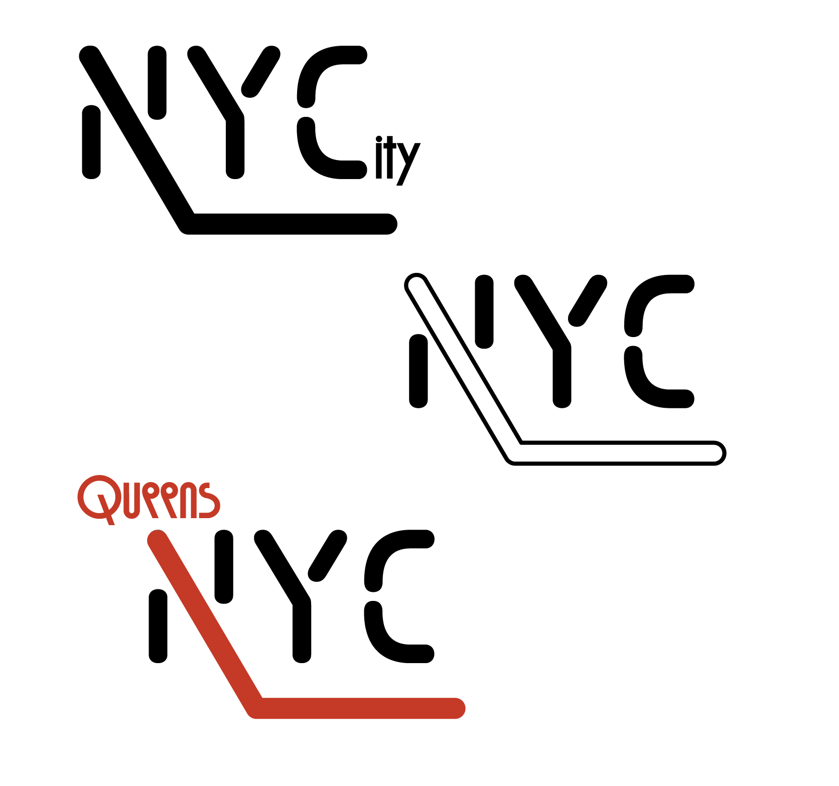
Revised Rough Drafts

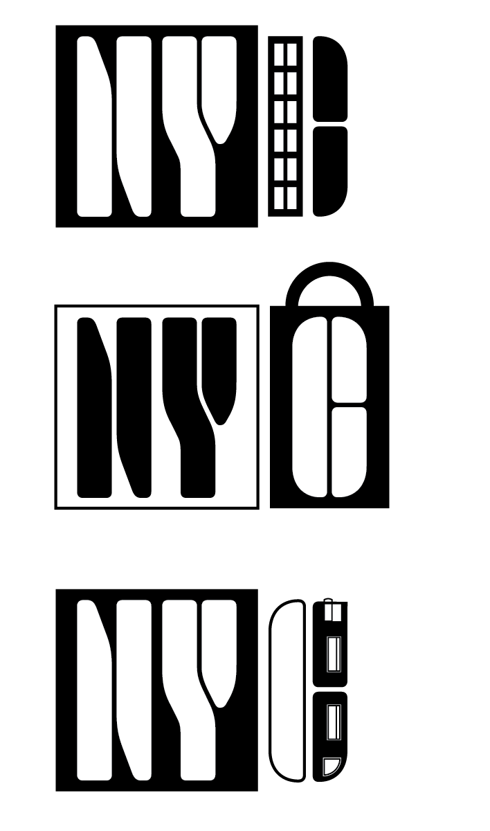
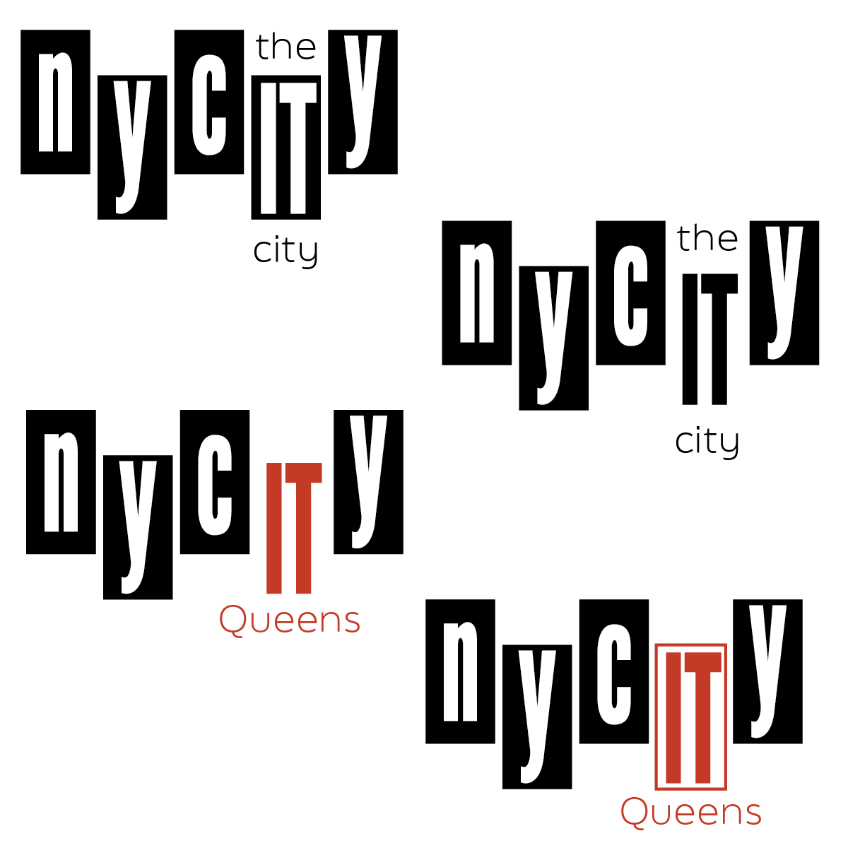
Revised Rough Drafts 2
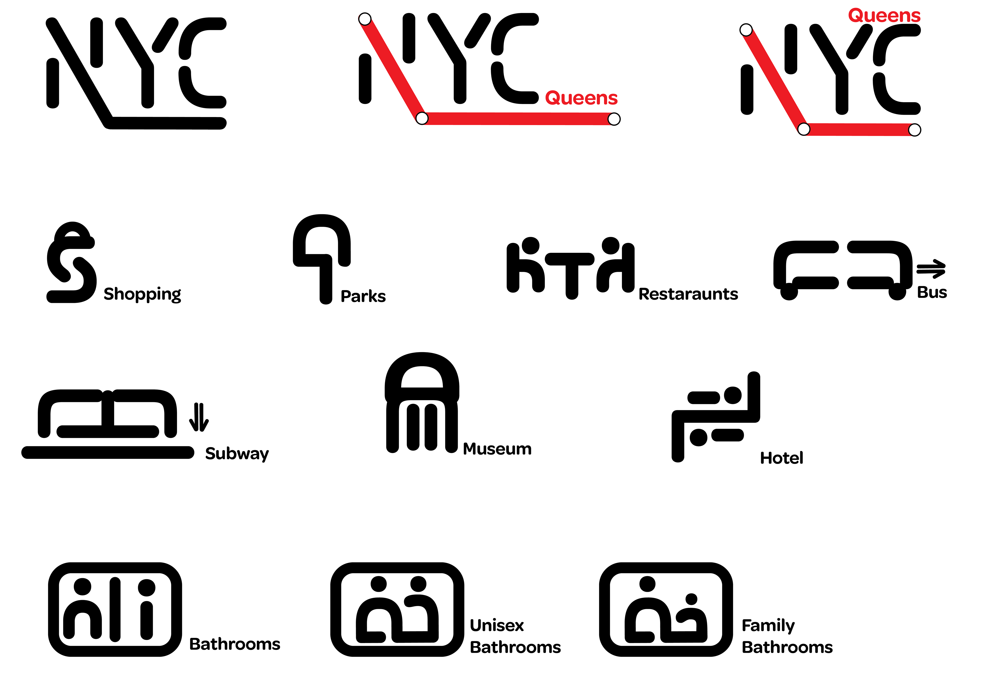
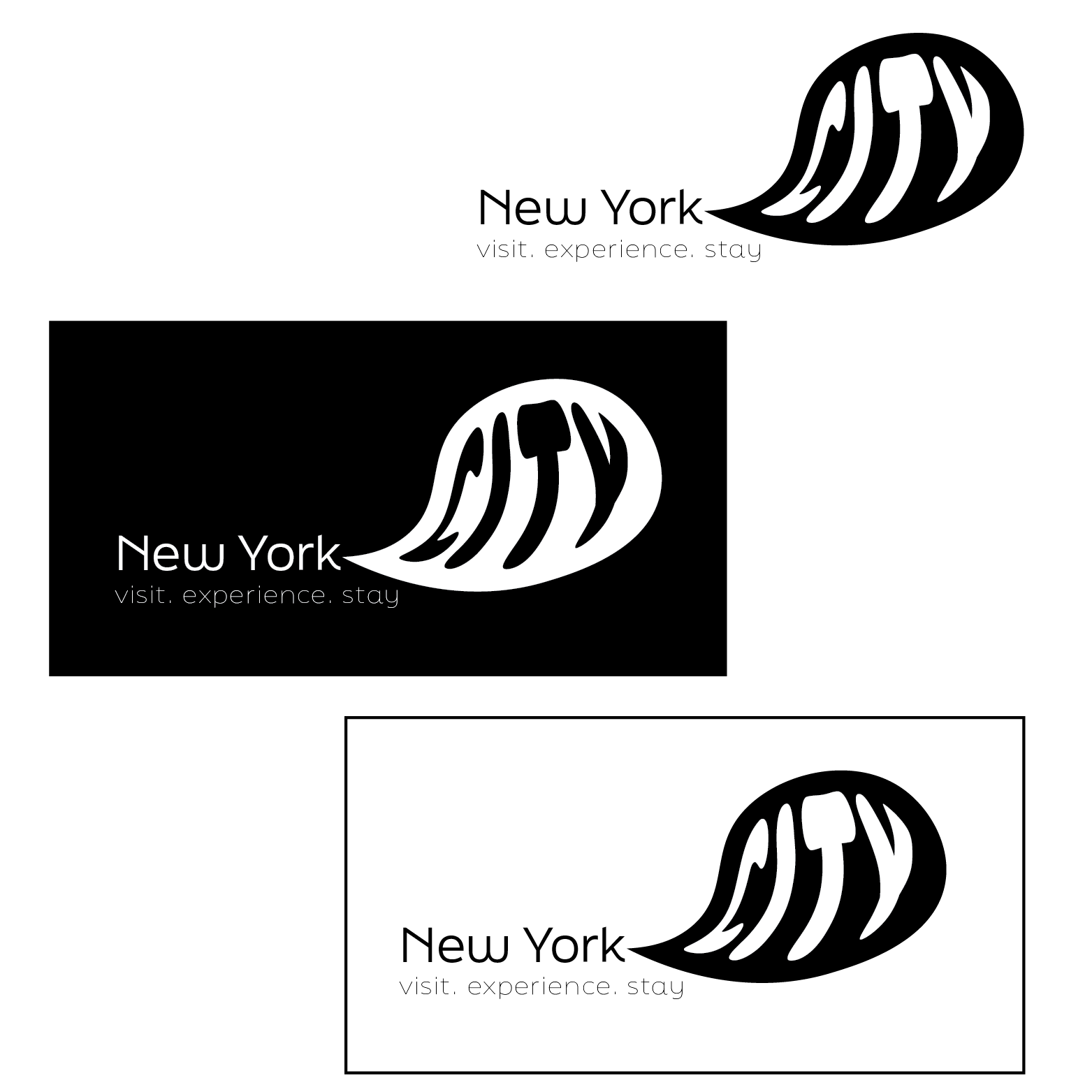
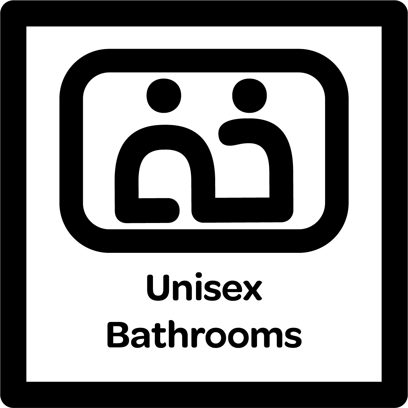
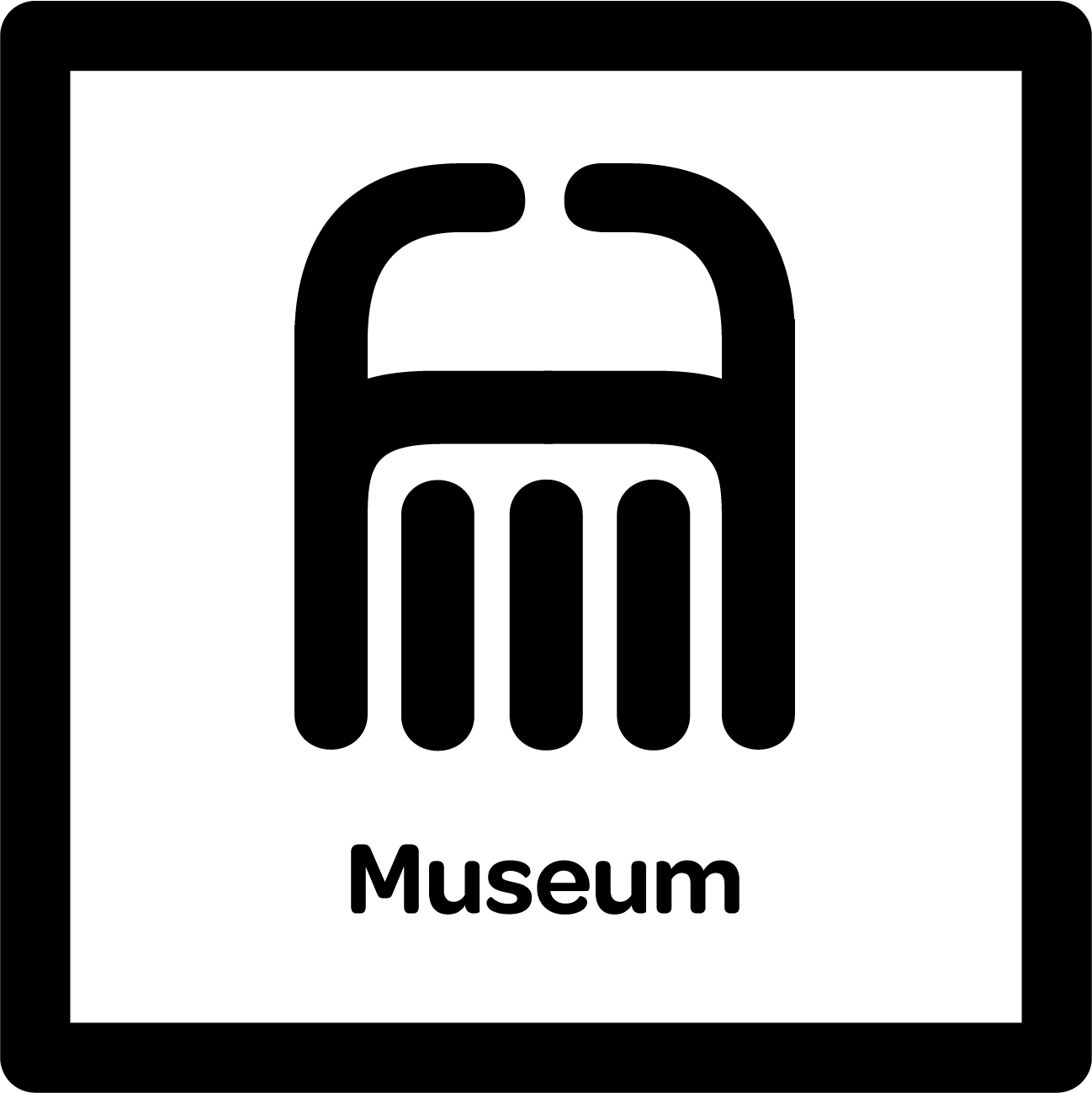
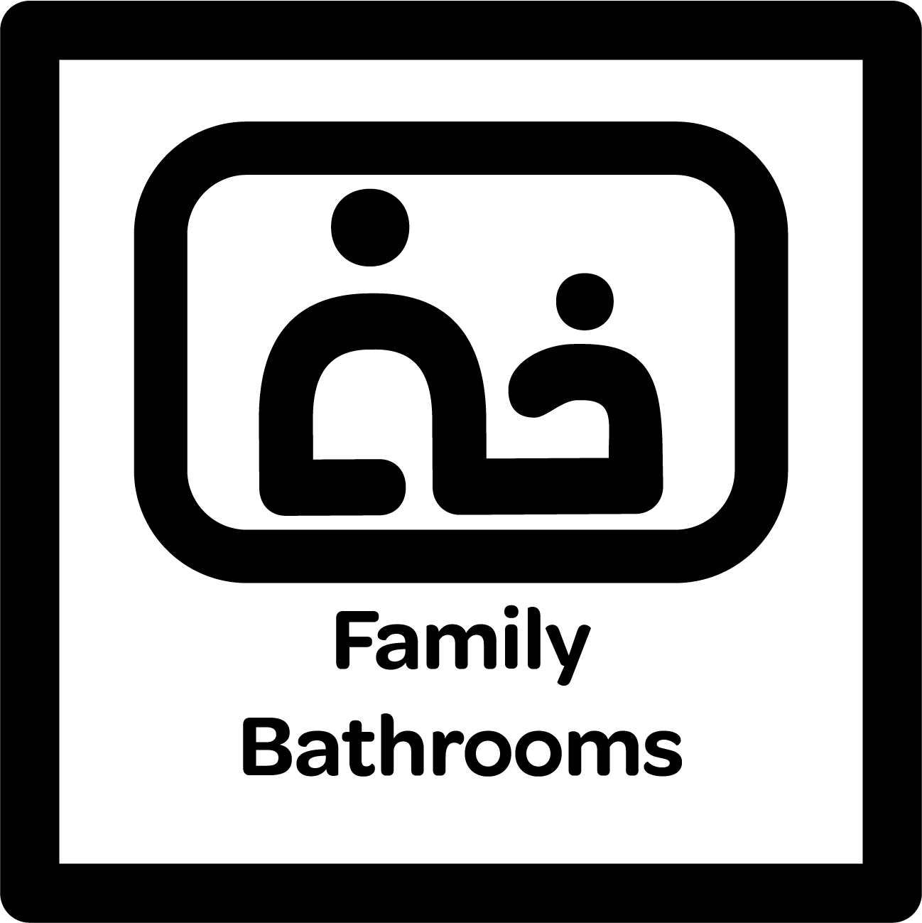
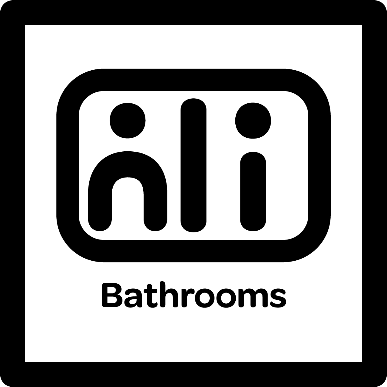
Final Designs and Mockups


The Takeaway:
The redesigned New York City branding system was successful because it worked well on many different branding layouts and incorporated New York City's overall aesthetic. Utilizing similar shapes and colors that could be found on NYC's subway map makes the new logo familiar to the target audience.